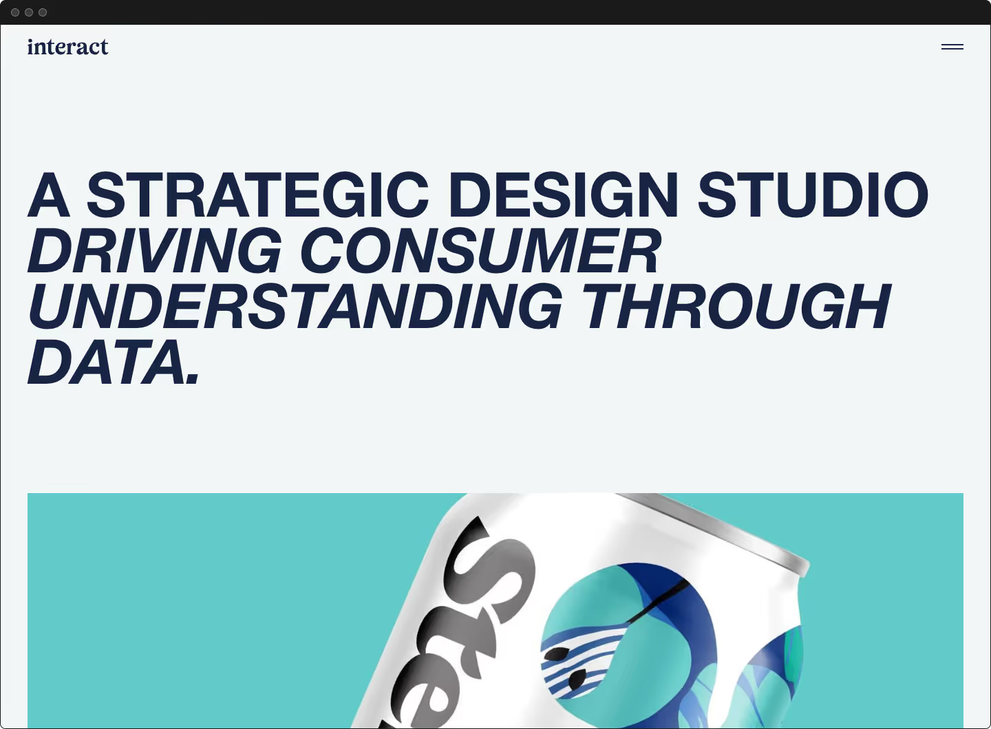
Increasing Revenue For An E-commerce brand
BLDWN

Services
Strategy
Competitive Research
Conversion Rate Optimization
CX Design
UX Design
UI Design
Development
Year
2015
<h2 class="heading-xxsmall">Summary</h2>
While their website was generating notable revenue, BLDWN leadership knew we could improve. We could increase organic traffic quality and quantity. The user experience and customer service could be optimized across the buying journey.
The team knew there was a sizable amount of money being left on the table. With the holiday season a couple of months away, it was crucial to be efficient and effective to capitalize on it.
<h3 class="heading-xxsmall">About BLDWN</h3>
BLDWN is a modern American fashion brand for men and women. They are inspired by the stories of American design and the collective group of American artists and creative minds that have shaped global culture.
Results
<p class="text-width-medium">We were able to affect several key performance indicators. That Holiday season was by far BLDWN’s best sales.</p>
+++
Substantial increase in add to carts and decrease in cart abandonments
CRO
Strong increase in conversion rate especially on mobile
3x
Page load time decreased by up to 3x
AOV
Increase in the average order value
The Goal
<p class="text-size-medium">The goal was to affect several key performance indicators,</p>
- Increase add-to-cart percentage
- Increase average order value
- Increase conversion rate
- Reduce client service requests by proactively addressing customer concerns
- Increase organic traffic by optimizing SEO rankings
The client wanted to maximize their existing investment, so our focus was on optimizing organic traffic and the buying journey. Our objective was to get more products in customers’ hands while reducing customer support inquiries.
The founder believed that the product spoke for itself as long as we could get the correct item in the customer’s hands.
Future initiatives would focus on growing paid traffic and reducing returns.
Plan of Action
<p class="text-size-medium">For the project to be successful, it was crucial to have a clear plan of action. We had a short timeline. Multiple internal departments and two freelancers, including myself, would have to collaborate efficiently to hit our deadline. An initial alignment meeting and incremental status meetings with all parties were crucial to maintaining vision and the timeline.</p>


<h2 class="heading-xxsmall">Research</h2>
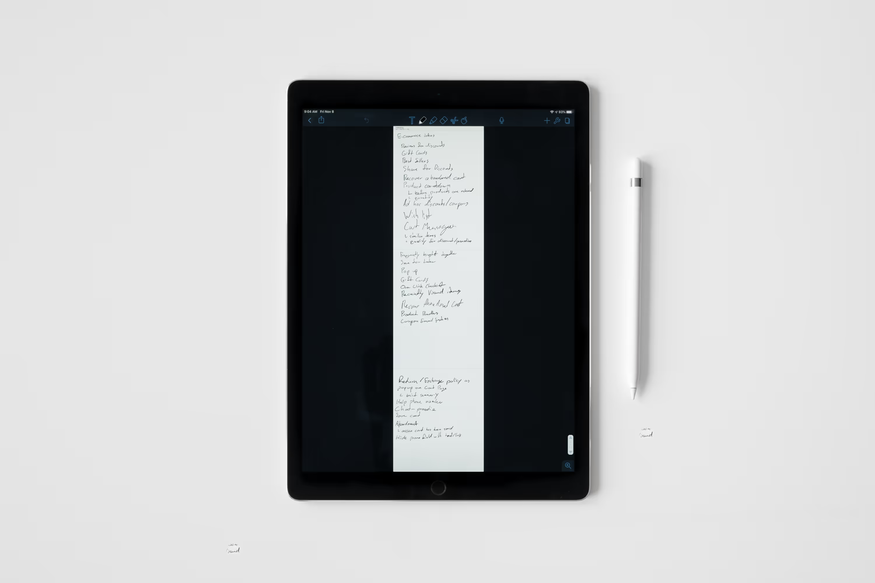
We did extensive competitive research to understand conventions and areas of opportunities.
We chose to focus on several key areas:
<p class="text-size-medium">Performance and Way-Finding</p>
- Decreasing page load time
- Adding category page headings and copy to improve SEO rankings
- Optimizing meta tags and alt tags to provide better accessibility and SEO rankings
- Providing clearer way-finding by adding bread crumbs to categories and product detail pages
- Simplify the main navigation and focus exclusively on sales-related pages
<p class="text-size-medium">Product Detail Pages</p>
- Add customer service related copy to product detail pages
- Add product care, model measurements and sizing information to product detail pages
- Introduce cross-selling on product detail pages
<p class="text-size-medium">Check-out Process</p>
- Shorten the buying journey by introducing a mini cart in place of a cart page
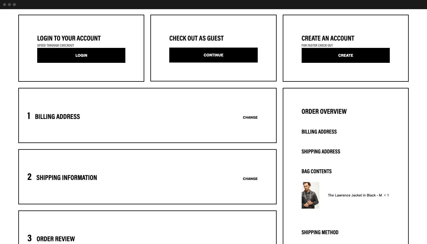
- Reduce mental load during the checkout process by creating a custom four-step checkout process and added a cart preview on page
- Allow customers to save their card information to streamline their checkout process

Design Begins
<h3 class="heading-xxsmall">Framework</h3>
My focus was on user experience and customer service design. Helping users find answers faster with fewer distractions, was my first step. Mobile was a significant percentage of traffic. Unfortunately, add to carts were substantially lower for mobile than other devices. Focusing on the mobile experience became a key focus for increasing the conversion rate as a whole.
<h3 class="heading-xxsmall">Design Process</h3>
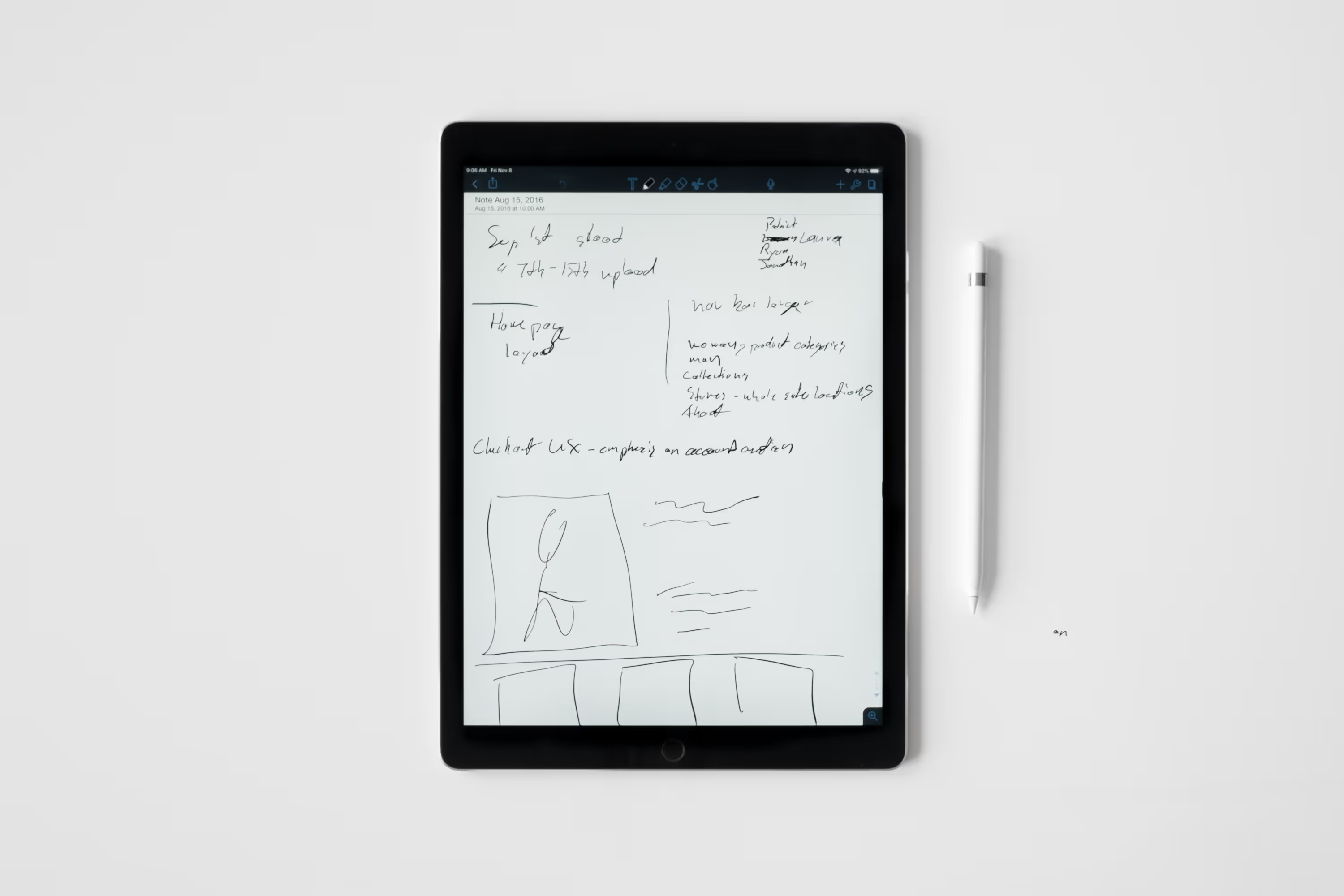
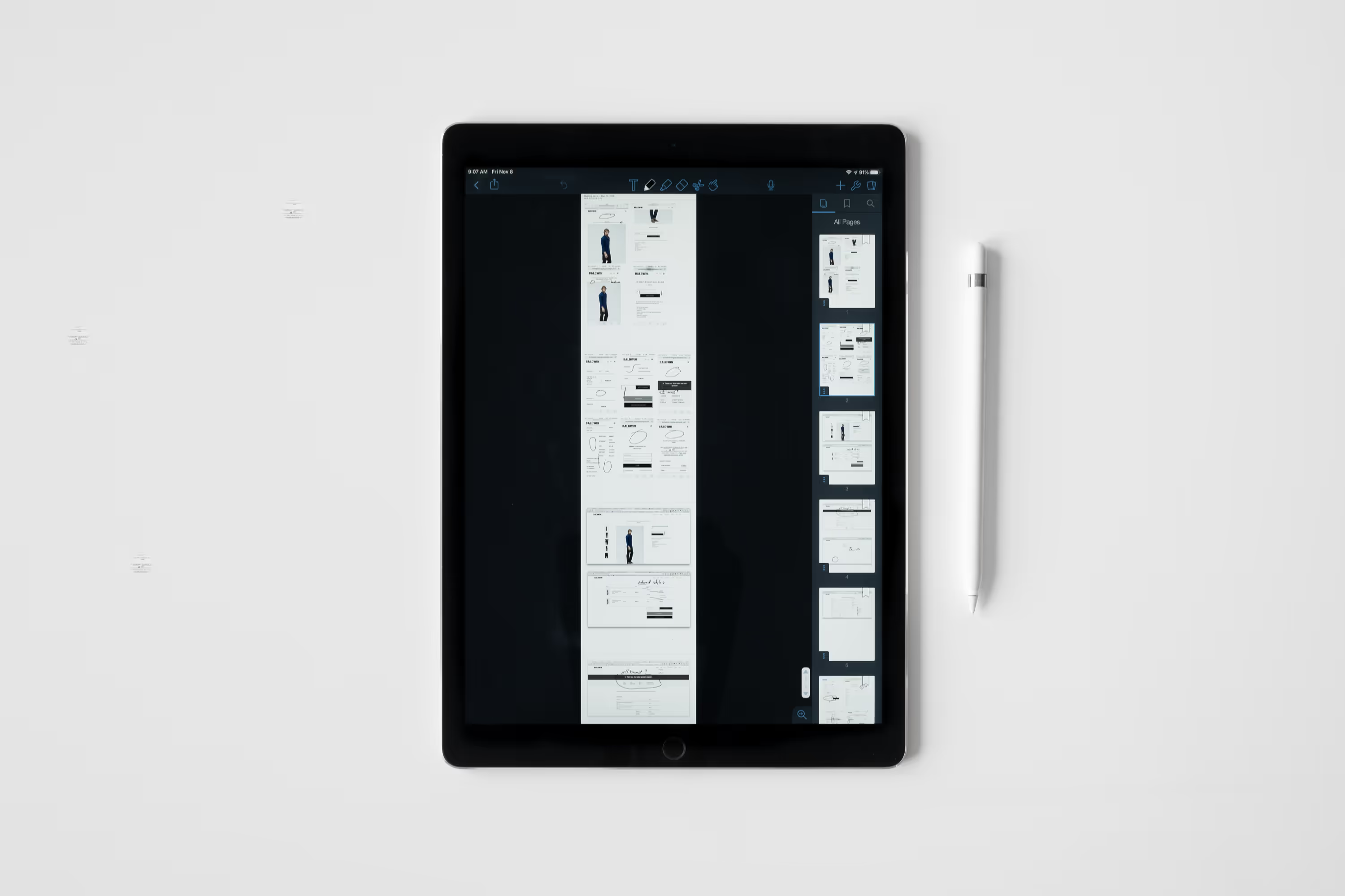
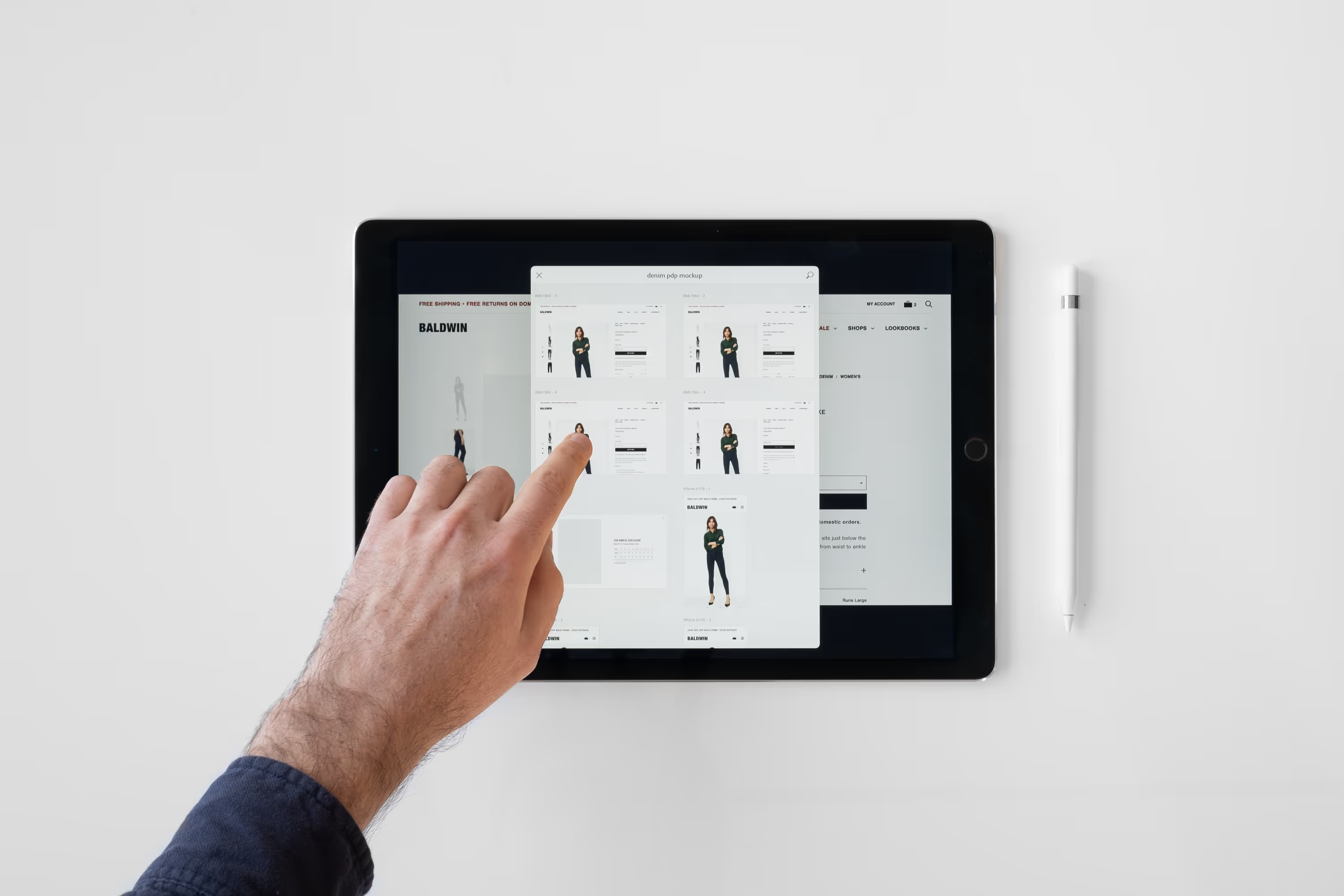
The wireframing phase involved several rough sketches to iterate through options, illustrate the direction and get buy-in from all parties. Once approved by the art department, I translated the wireframes into high fidelity prototypes to get full alignment from the art department and marketing department as well as final approval from ownership. This part entailed a lot of back and forth between departments and myself but ultimately it allowed us to maintain efficiency through development and avoid any unwanted surprises.
<h3 class="heading-xxsmall">Development Process</h3>
Development was largely straight forward. I did active development on a local copy of the site while we iterated through rounds of approval on a staging version of the site.
Removing Distractions
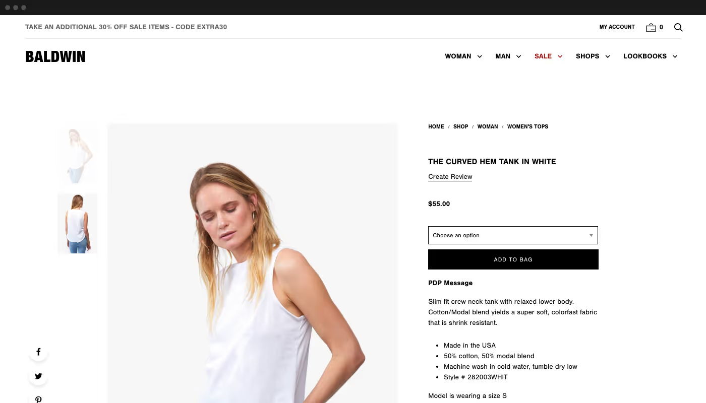
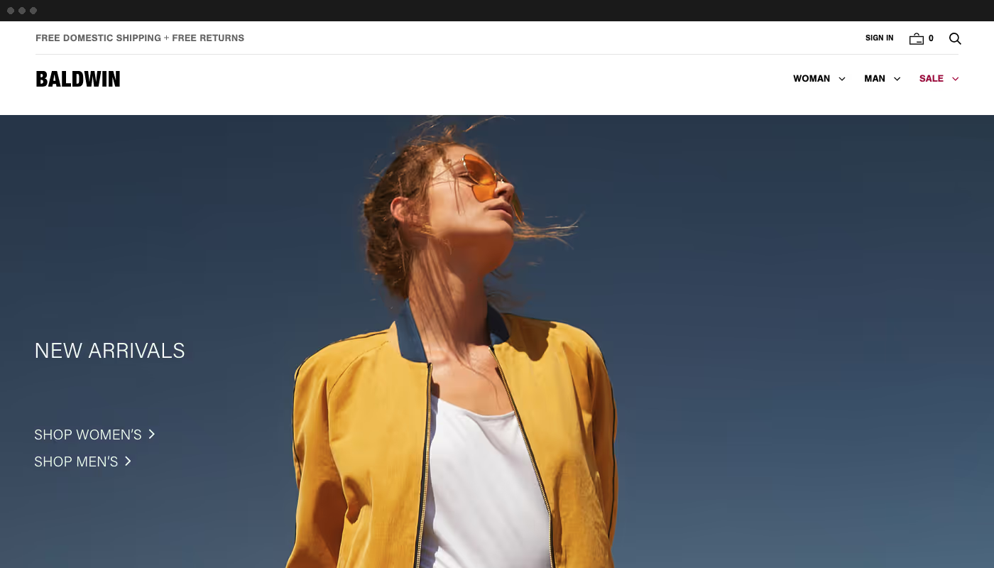
<p class="text-size-medium">To increase add to carts and reduce cart abandonment, we optimized the main navigation. Only sales-related pages remained in the header. The main navigation included simpler top-level navigation and prioritized sub-navigation. We moved all brand and customer service related links to the footer. </p>
Better way-finding and Customer Service
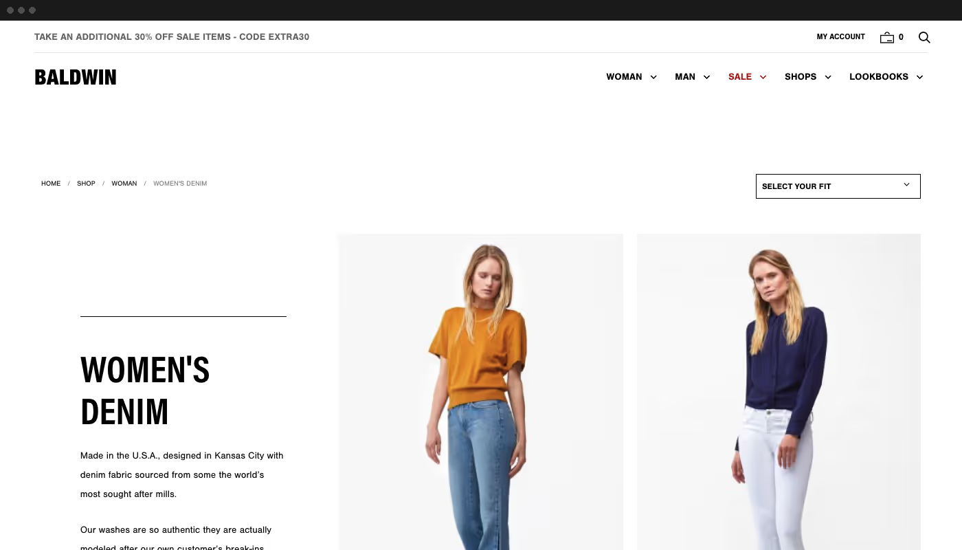
<p class="text-size-medium-large">On product category pages, we added headings and brief copy descriptions. For SEO, we added breadcrumb navigation to both product category and product detail pages too.</p>


<h2 class="heading-xxsmall">Product Detail Pages</h2>
On product detail pages, we focused on better customer service and intelligent cross-linking to other products promoting cross buying.
To increase users' comfort and confidence purchasing, we added:
- Fit information
- Model measurements
- Links to fit guides
- Copy specifying if the item ran small, true to size or large
We reworked the primary copy to be emotive. Material information and care instructions were included as well but separated to reduce cognitive load.
To provide greater customer service and support buyer confidence, we included shipping, return and customer support contact information.

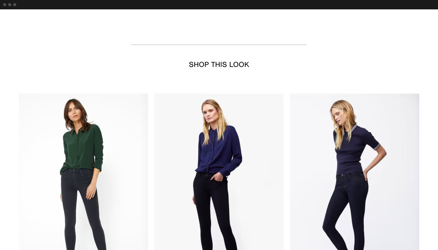
Finally, we added both a “Shop this look” and “Items you might like” sections at the bottom of the product detail pages to promote cross-selling and upselling.

Shortening the buying journey
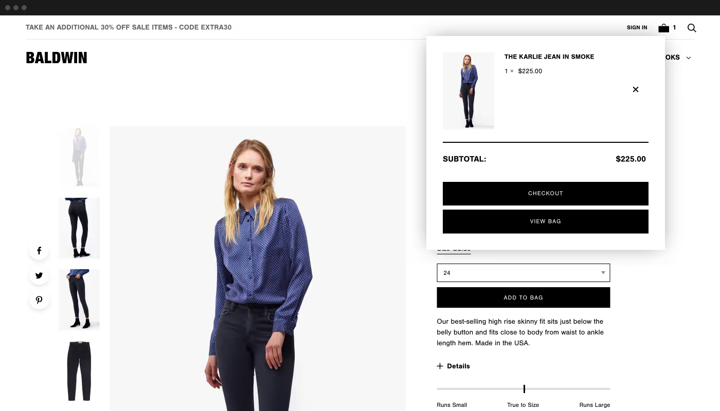
Ideally, a user would be able to have a product shipped to them within three pages including the page they initially landed on.
To reduce cart abandonment, we implemented a mini cart to get us to a 2-3 page buying journey. By reducing the extra step of a dedicated cart page, we substantially reduced the number of steps in the user’s checkout process.
The Checkout Experience
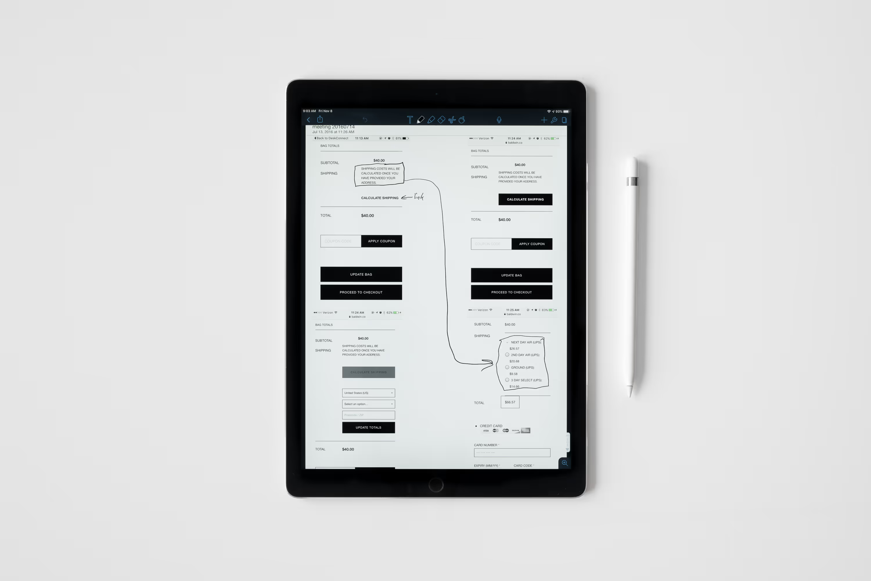
Everything went pretty smoothly until we got to the custom checkout process. At face value, it appeared straight forward but upon starting became way more complex. Getting this wrong could cost the company a lot in missed sales. There is a reason why Shopify is so proud of its checkout journey.

Resolution
<p class="text-size-medium">After several iterations and user testing, we arrived at a solution that accomplished everything we wanted. Interestingly, Shopify’s checkout page, as of writing this case study, closely resembled what we developed several years ago. </p>
There was a myriad of other changes made. We adjusted product category pages and product detail pages to include more initially copy for both users and SEO. We added fit information including model measurements and if an item ran small or large on product pages to help customers get a better idea of how an item would fit them.

