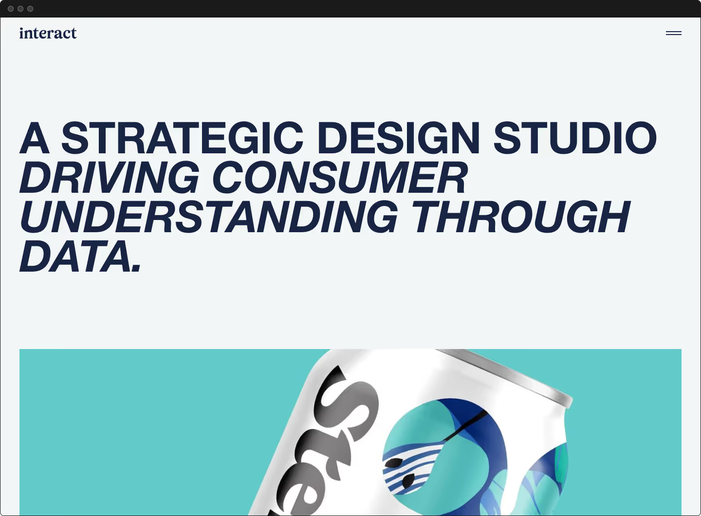
Increasing Sales for a web3 platform
Strategy, branding and product design for a leading web3 start-up

<p class="text-size-medium">Obscura is a leading web3 photography organization. It connects photographers and collectors in their shared passion for the photographic medium.</p>
Their team is comprised of photographers, many Latin American, who are painfully familiar with the failings of the existing photography ecosystem. They utilize the burgeoning web3 infrastructure to build a more inclusive, robust, and forward-thinking ecosystem supporting photographers and collectors.
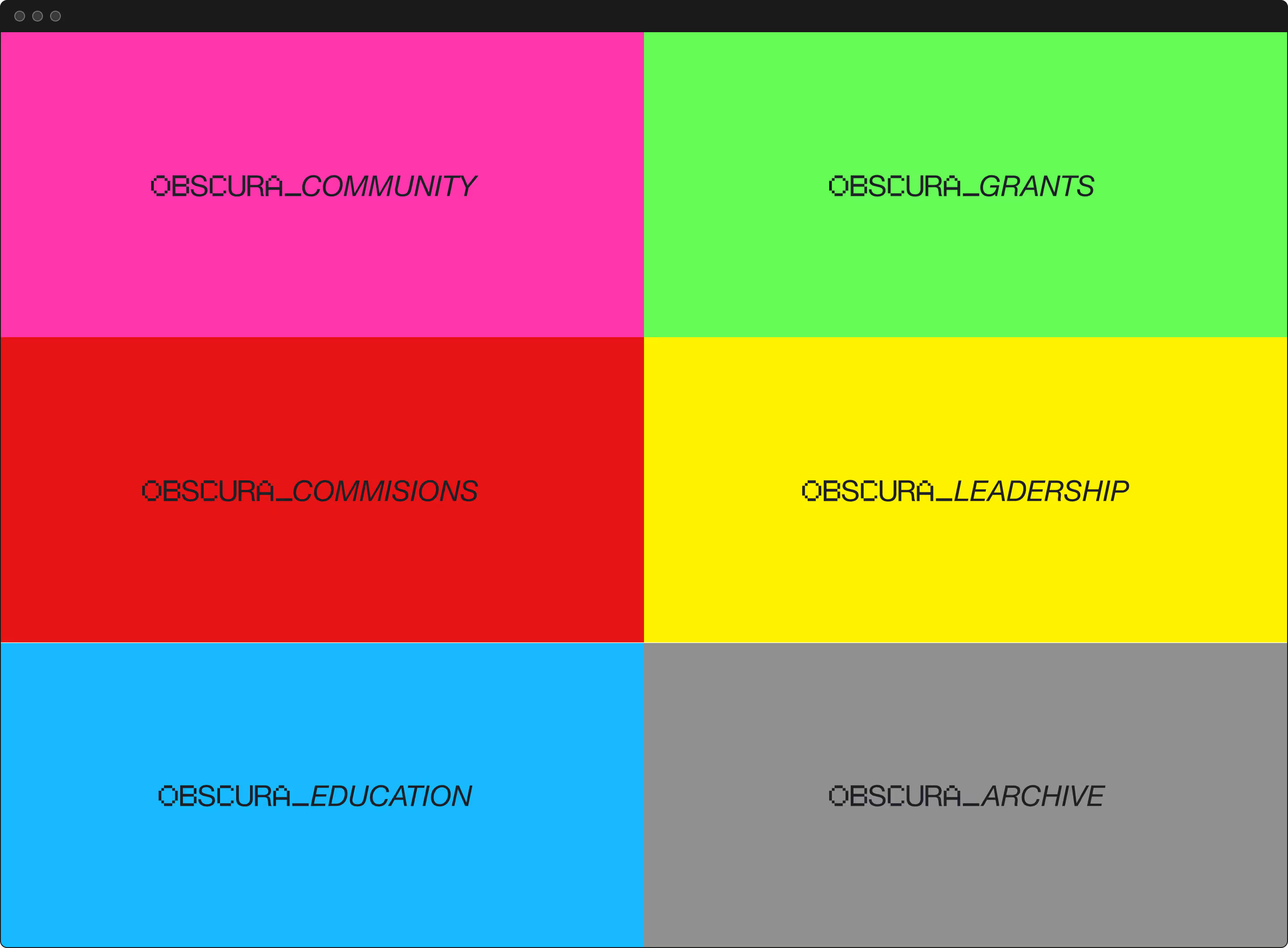
Obscura provides curatorial services, education, photographer on-boarding, web3 native archiving, community, leadership, and photographer grants/commissions.


The Outcome
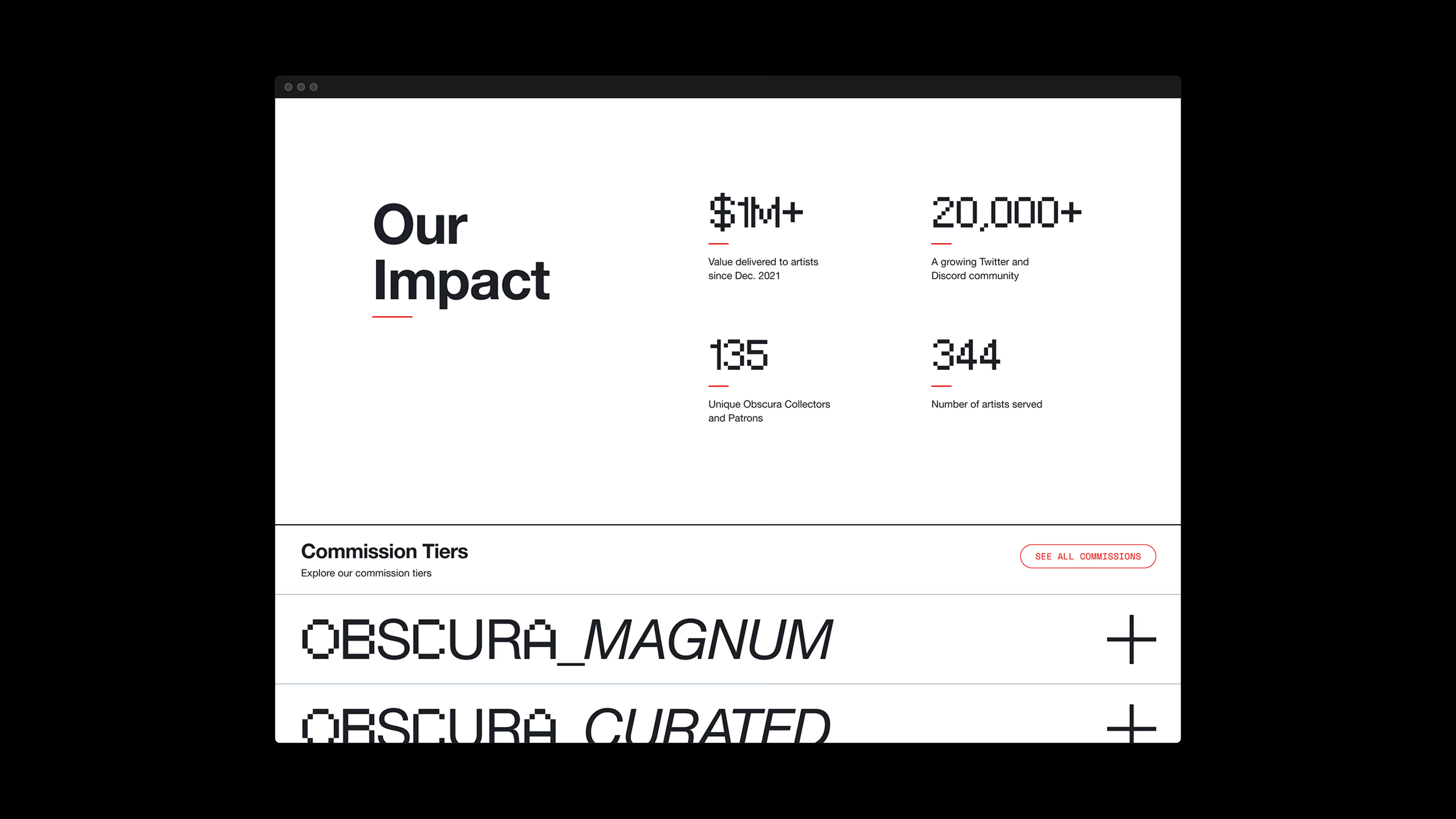
Project results from Dec 2021 – to May 2022:
$1m+
$1,200,000+ value delivered to artists
500+
Unique Obscura collectors and patrons
366
Artists served
20k+
Twitter and Discord community
The Mission
<p class="text-size-medium">Obscura needed a more effective strategy for selling their core product (their primary source of revenue), a digital home, and a visual language to advocate for them.</p>
Their founders brought me at the start of their journey to assist them with strategy, branding, a design system, and a high-fidelity website prototype.
My unique experience helped them navigate this vital part of their journey: fourteen years as a photographer, twelve years as a product designer, eight years as a strategist, and one year in crypto.
I collaborated with the founders as a consultant and product designer.
Our engagement started with branding, then building an extended design language for multi-channel distribution, and culminated with a high-fidelity website prototype.
The Gap
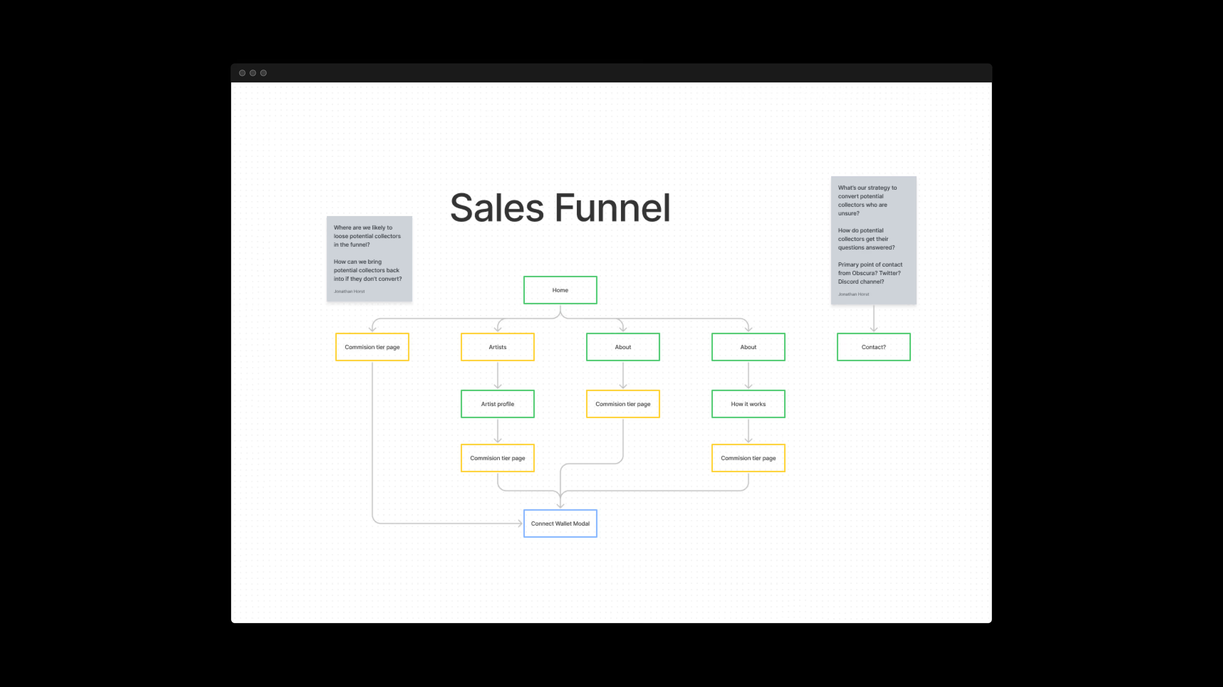
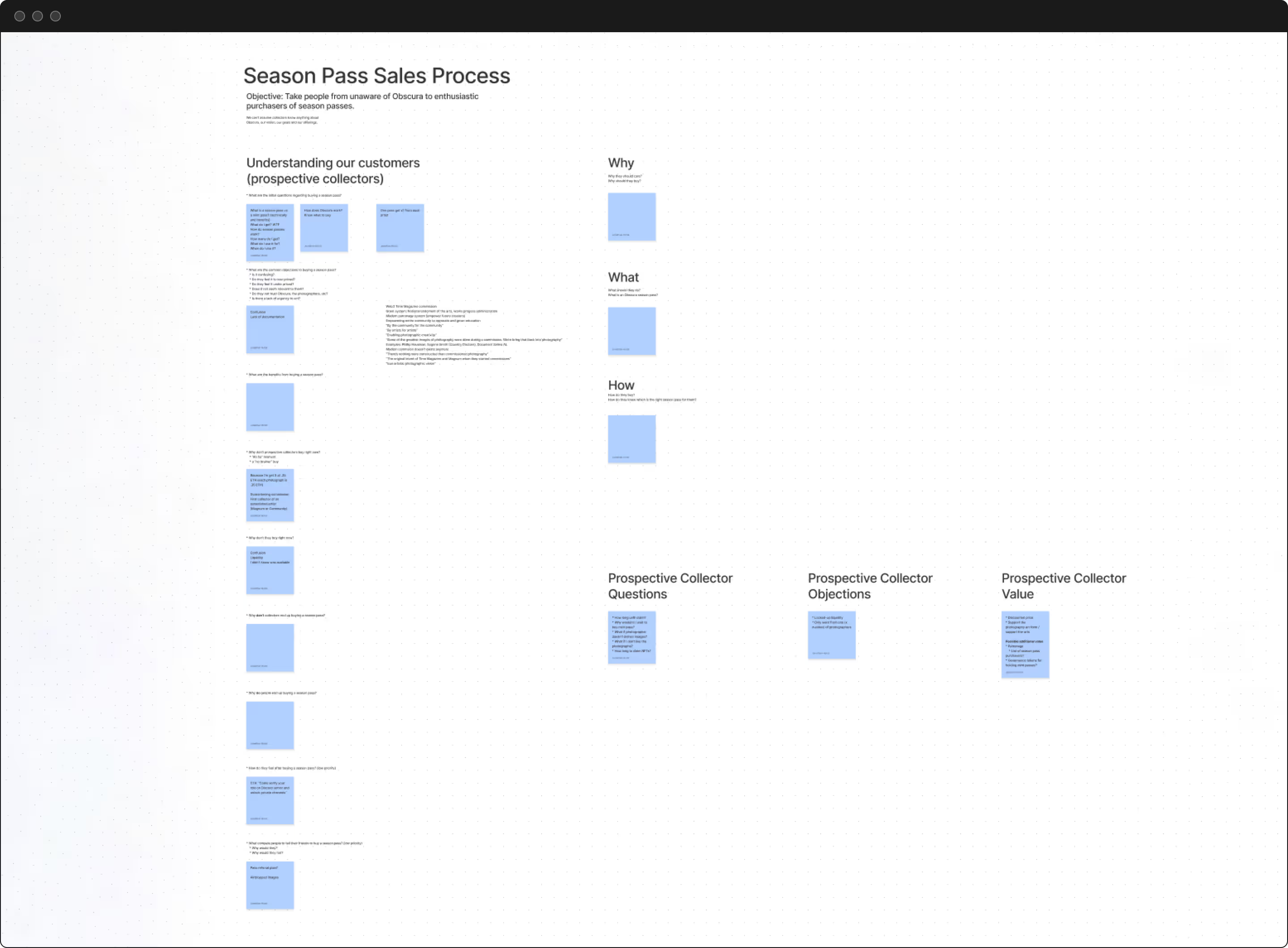
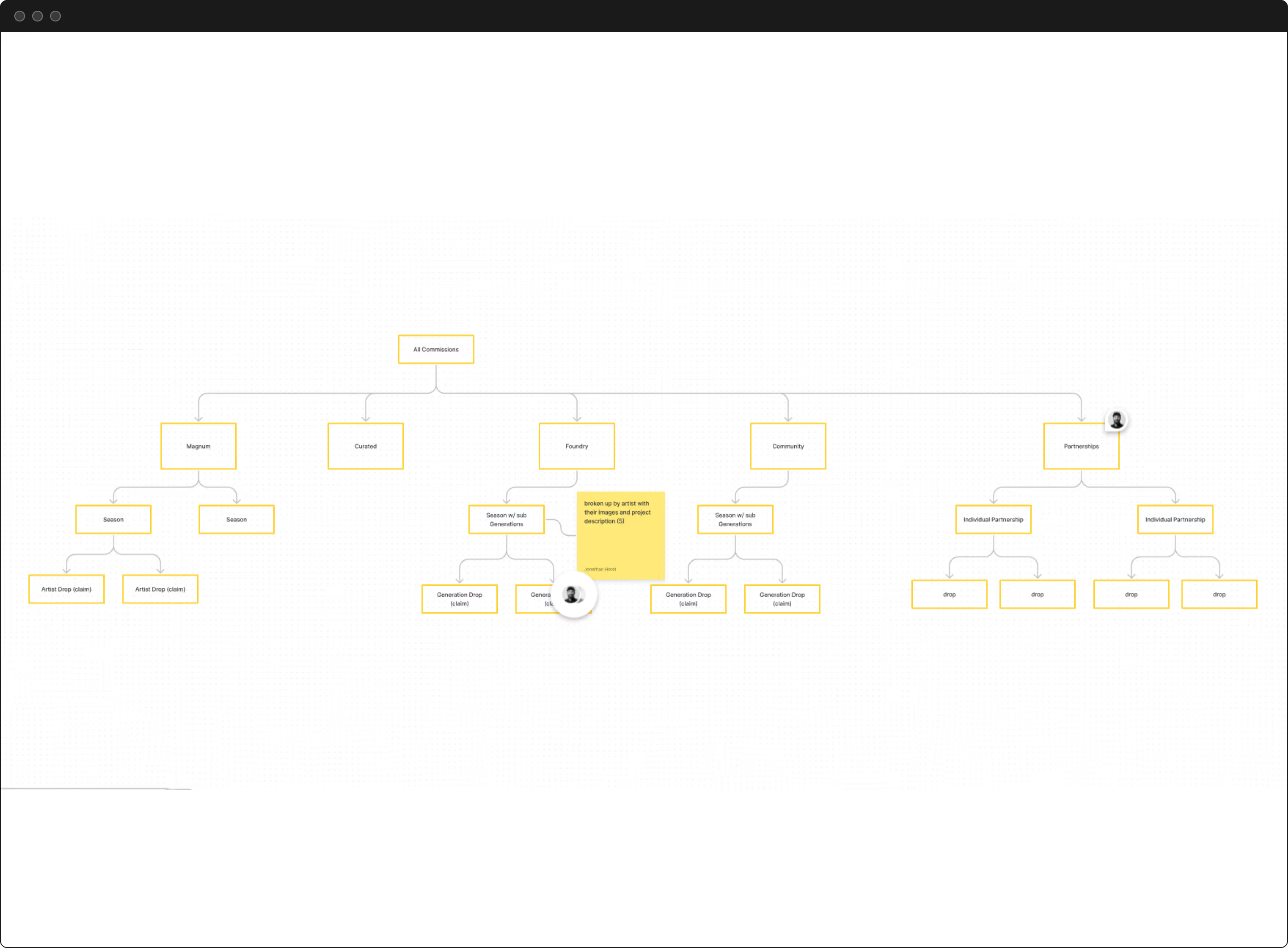
Before starting the project, Obscura had already sold several units of their core product. Unfortunately, the product was confusing due to having several variants. Customers (collectors) often did not know which variant was best for them. Collectors understood the value but suffered from indecision. Consequently, the Obscura team struggled to sell and was concerned about selling future releases.
A significant portion of the project was designing a more intuitive sales journey.
The Process
<p class="text-size-medium">It’s crucial to have stakeholders in alignment before creating deliverables—misalignment results in steps backward and frustration.</p>
Web3 time moves much faster than web2 time. We needed to move fast, be strategic, and avoid critical missteps. To do so, I took a highly collaborative, scaffolding approach. We had regular check-ins for feedback and revisions. Everyone moved towards a shared vision, refining along the way with minimal pauses or steps backward.

Discovering Needs
<p class="text-size-medium">Many leaders are visual people. Translating ideas into visuals as early and often as possible helps align all parties and often reveals novel discoveries.</p>
To lay the proper foundation, we started with discovery spelling out the core motivations of the brand, inspiration, aspirations, and ethos, among other things, in a free-flowing yet guided session with the founders. We identified and discussed the needs of different users and documented the founders’ learnings from preliminary sales.

Branding Begins

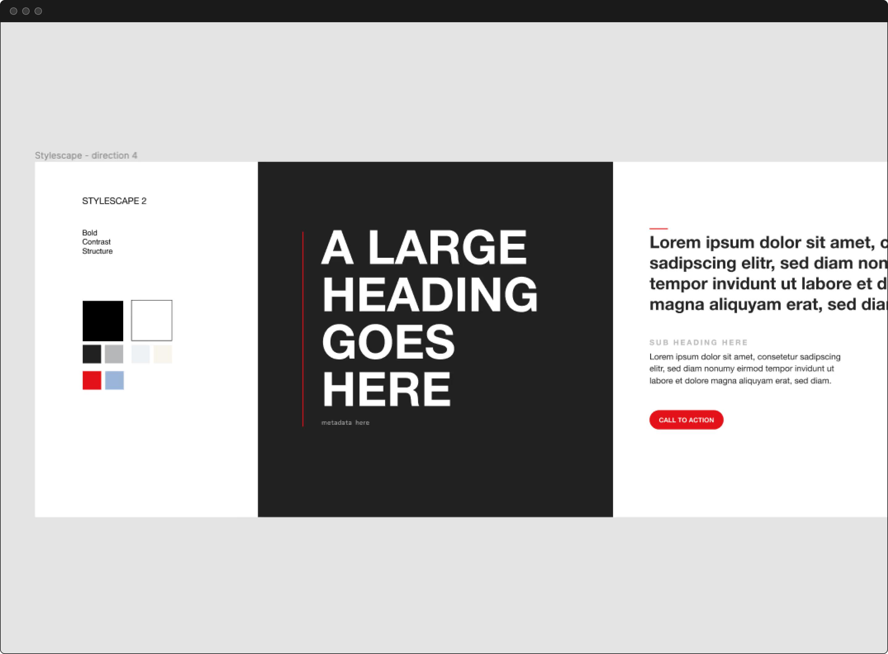
<p class="text-size-medium">With these insights, I started compiling visual inspiration to translate our discovery results into three potential visual identity directions utilizing a technique called Stylescapes. As necessary, we eliminated, merged, and refined to a singular visual direction. We combined a broad cross-section of content types, including branding, wayfinding, web design, and photography, to provide a comprehensive and cohesive direction.</p>
The founders are photographers and well-versed in conceptualization. We moved quickly and aligned on a direction within only a couple of iterations. The founders enjoyed the process. They were excited that all our proceeding work manifested into something tangible, if preliminary. We further aligned the founders’ vision and revealed additional insights about the brand’s purpose.
The direction combined timelessness and minimalism with elements of futuristic design. We needed a visual language that supported not distracted from the photographs while embracing the web3 ethos. I was stoked with the direction we identified because it is a visual space I enjoy.
The Logo
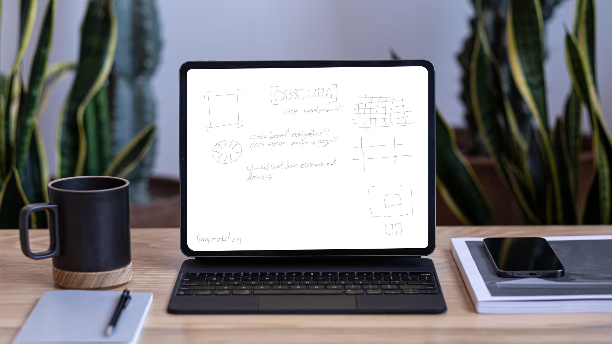
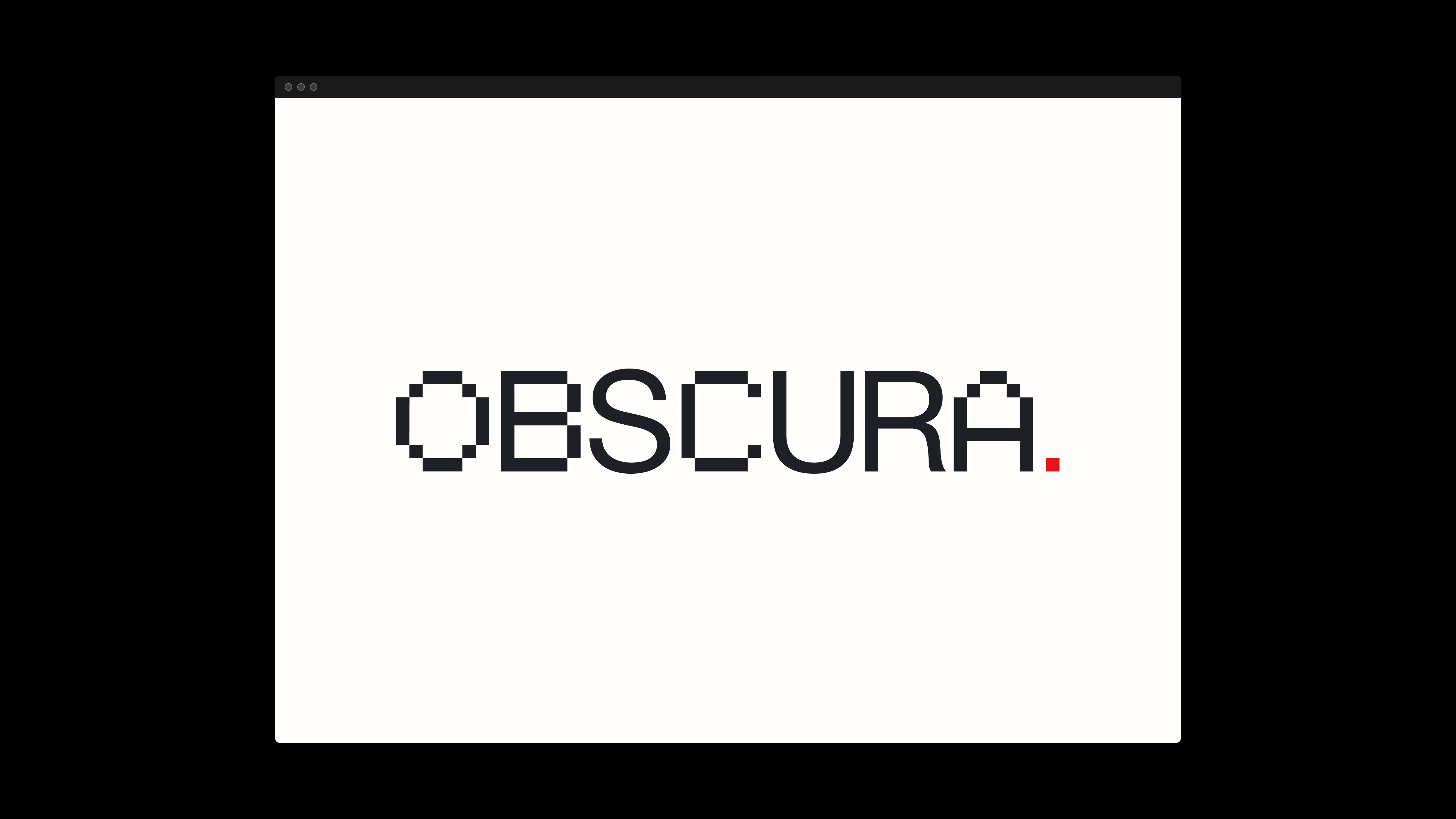
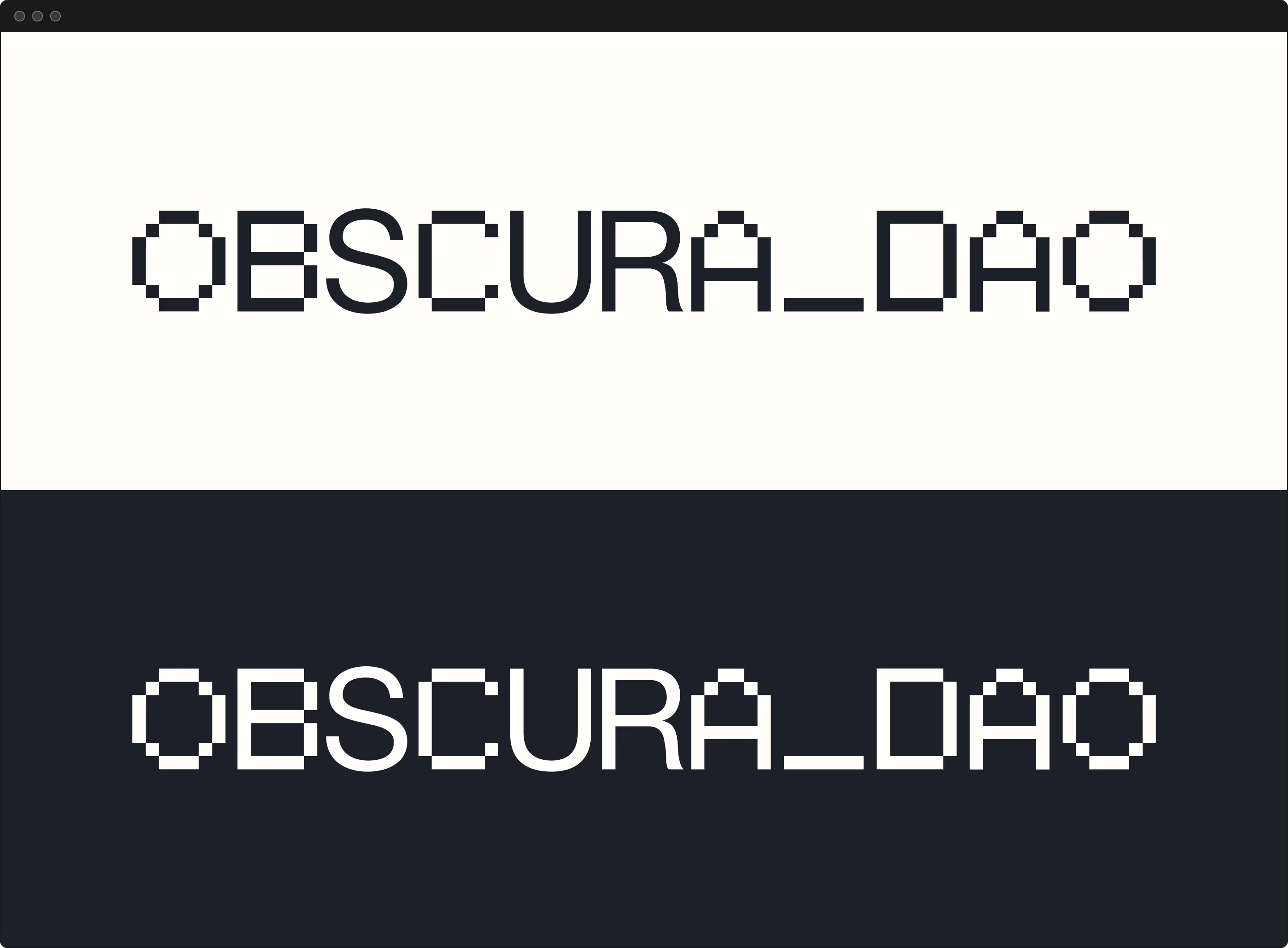
With a Stylescape direction approved, I started translating our discoveries into a flexible brand and design system. While the process went pretty smoothly, we encountered difficulties with the logo. This is common. A logo is the core element of a brand’s identity and often carries significant emotional weight for the founders.
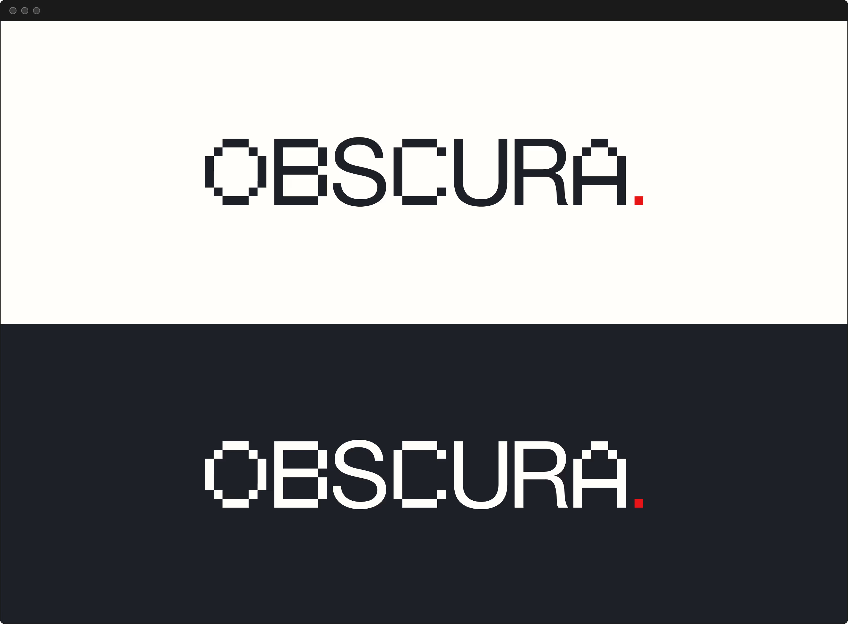
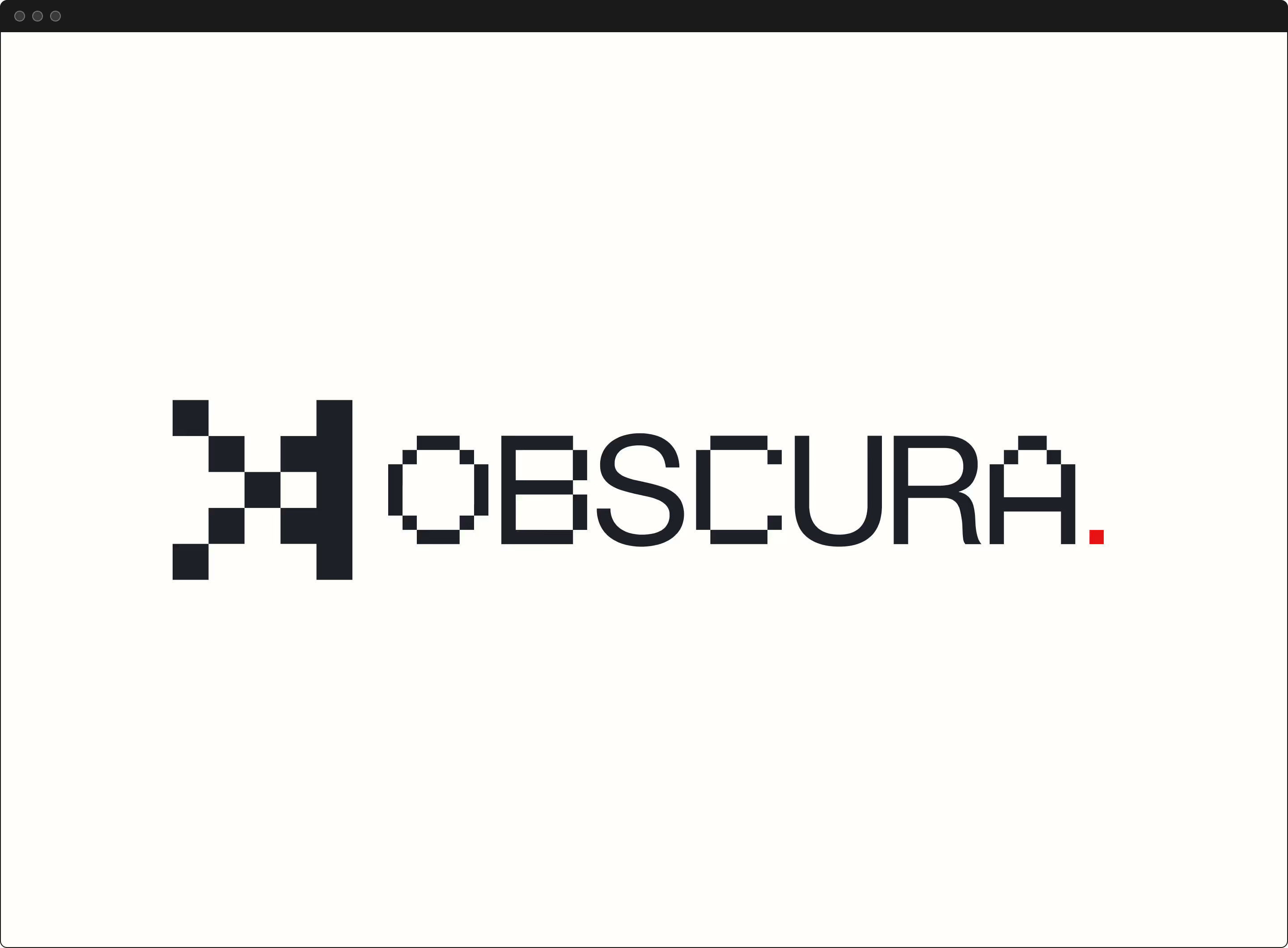
Our discovery documentation provided objective goalposts to avoid unnecessary time expenditure. After exploring several directions and iterating through revisions, we arrived at an option the founders aligned on. Most importantly, the founders, team, and community loved it too.



Design system

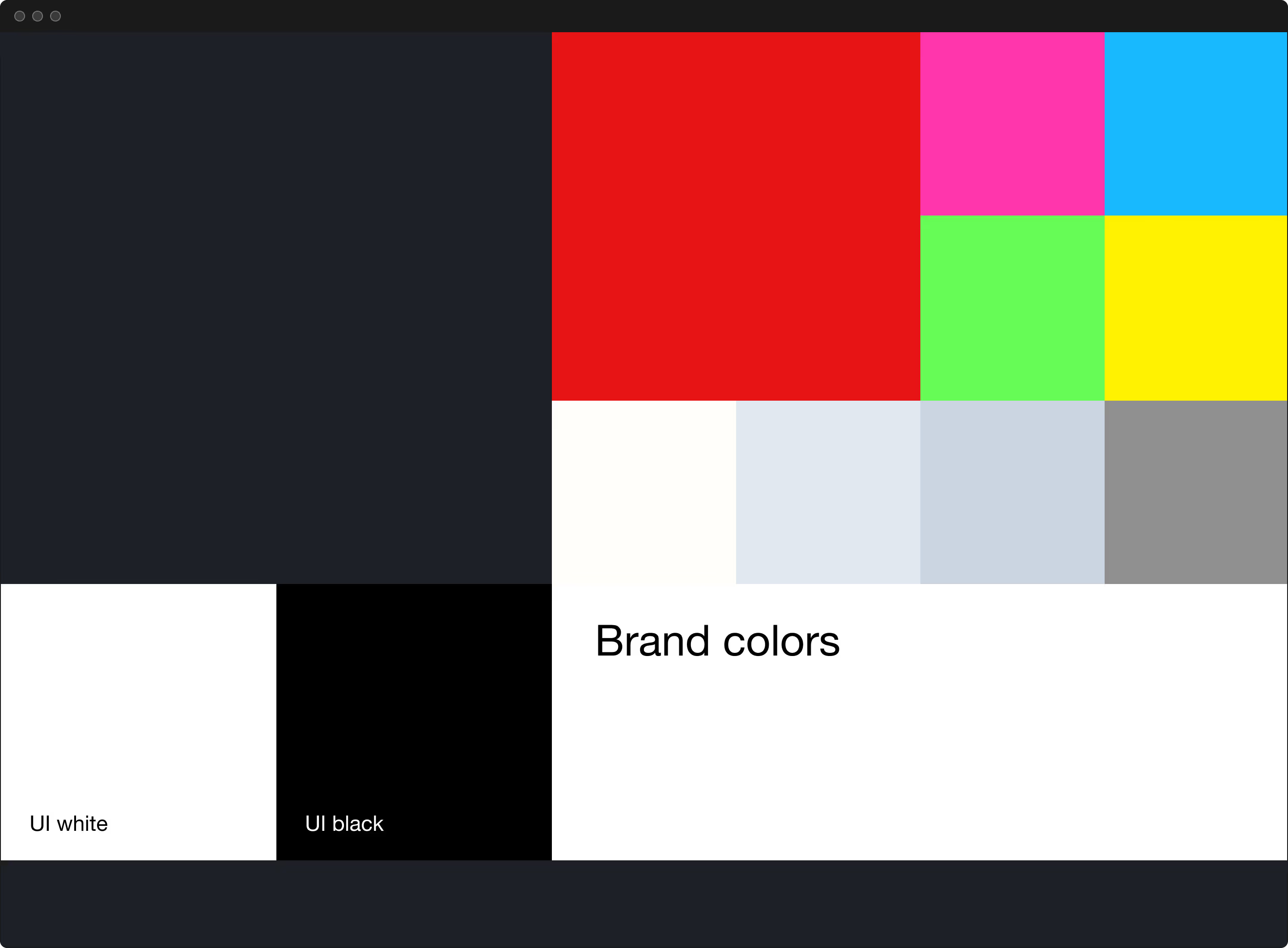
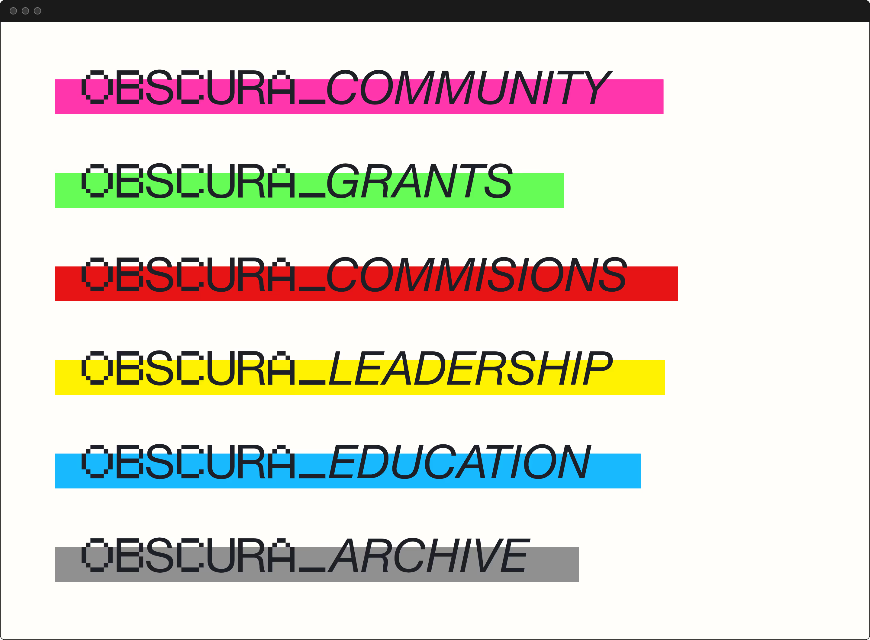
<p class="text-size-medium">The rest of the branding process had its hurdles, but we made excellent time. The founders were happy with the results and pace we were keeping. We continually referenced Obscura’s mission and users to keep our focus on serving their users. Through every step, we further solidified Obscura’s mission.</p>
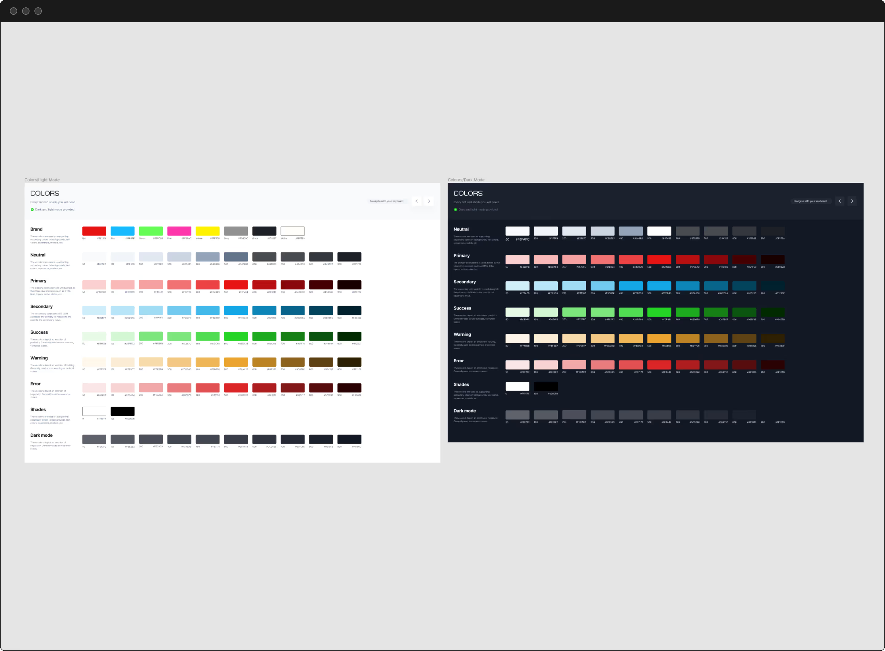


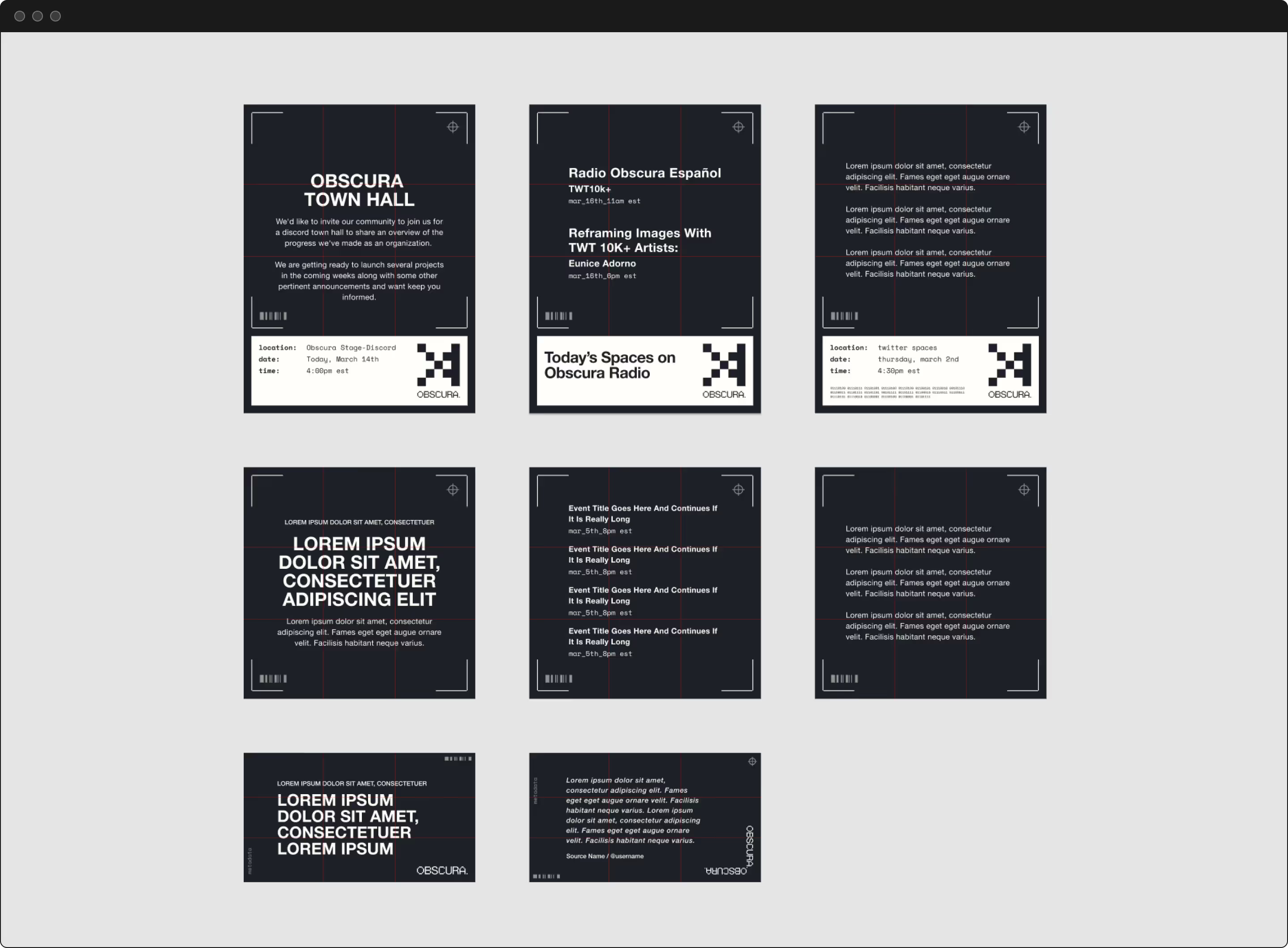
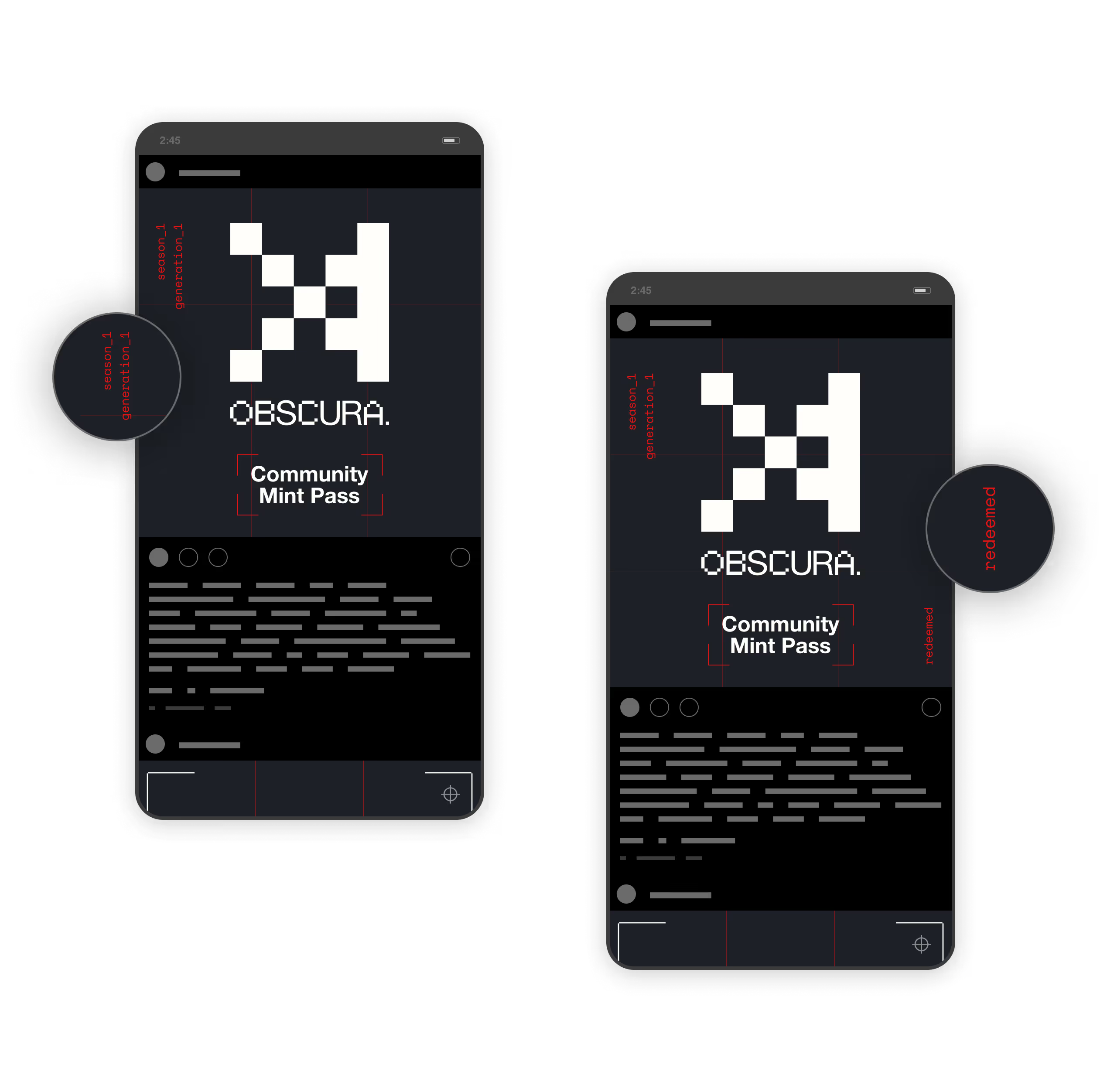
<p class="text-size-medium">From here, I built out a design system that we could utilize across mediums to facilitate cohesive visual communication. All assets are in Figma to maintain brand guidelines while enabling ease of use for the distributed team.</p>


Website Planning
<p class="text-size-medium">Scope creep and founder bandwidth became significant hurdles during the web design planning phase.</p>
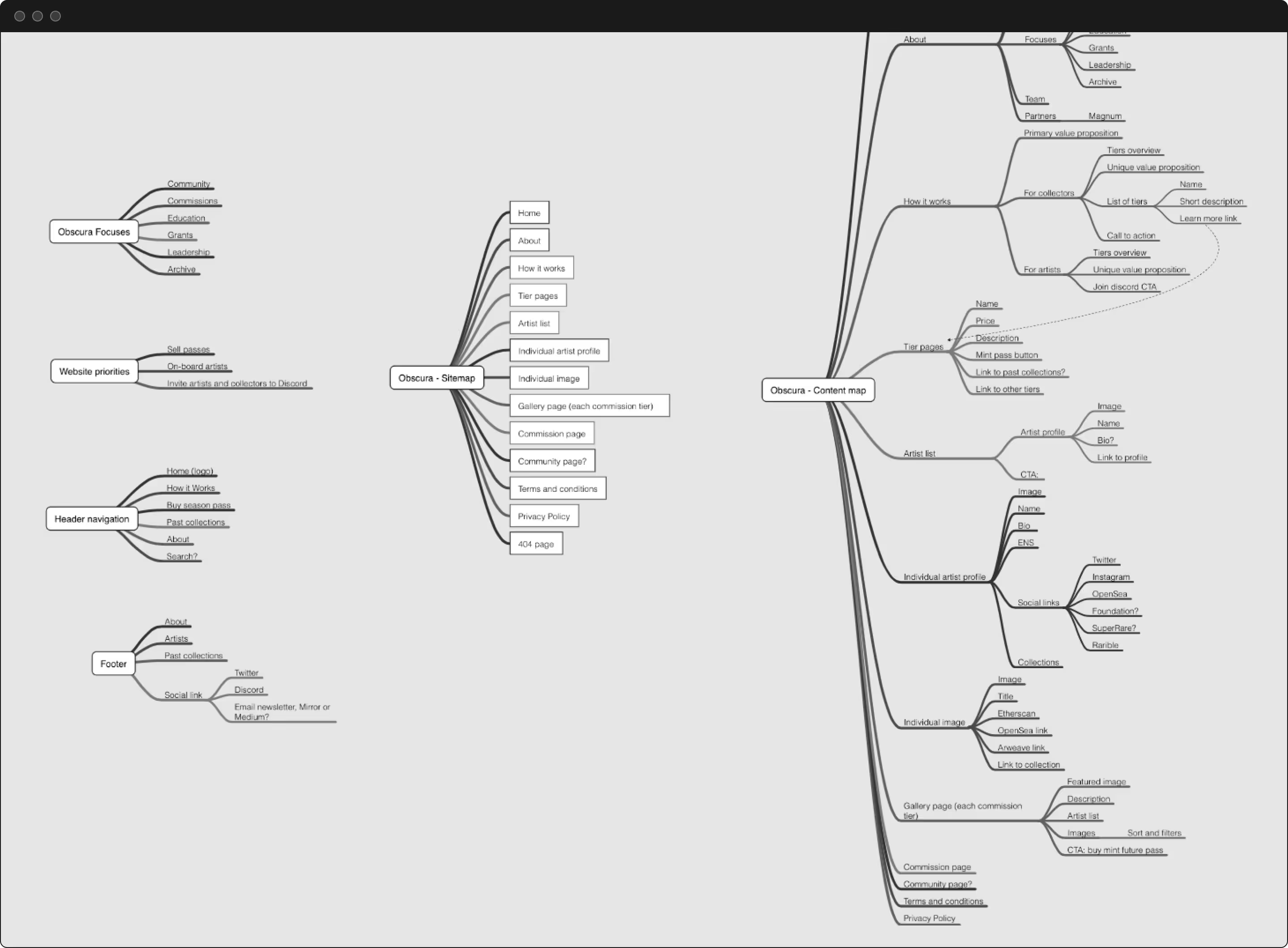
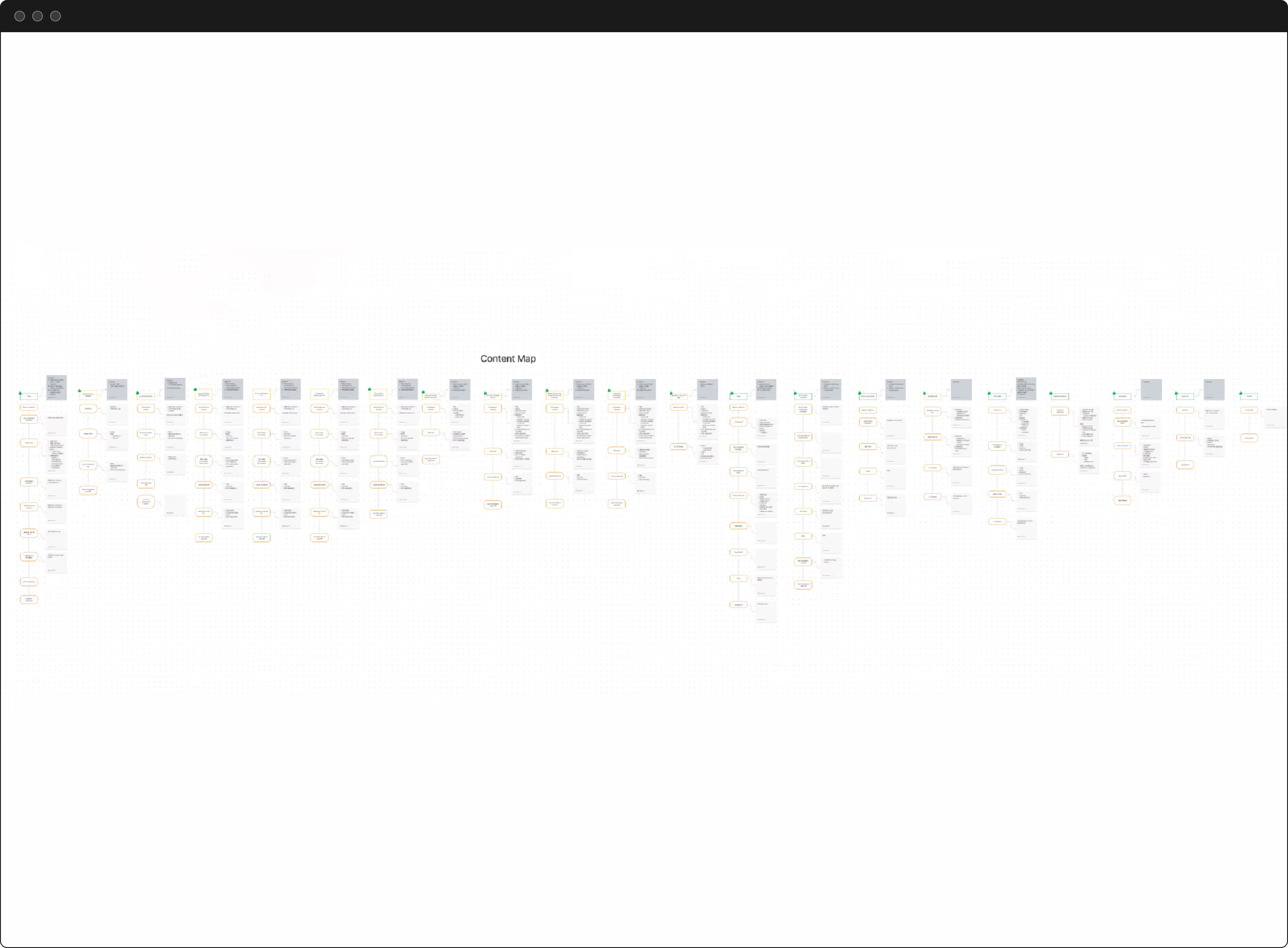
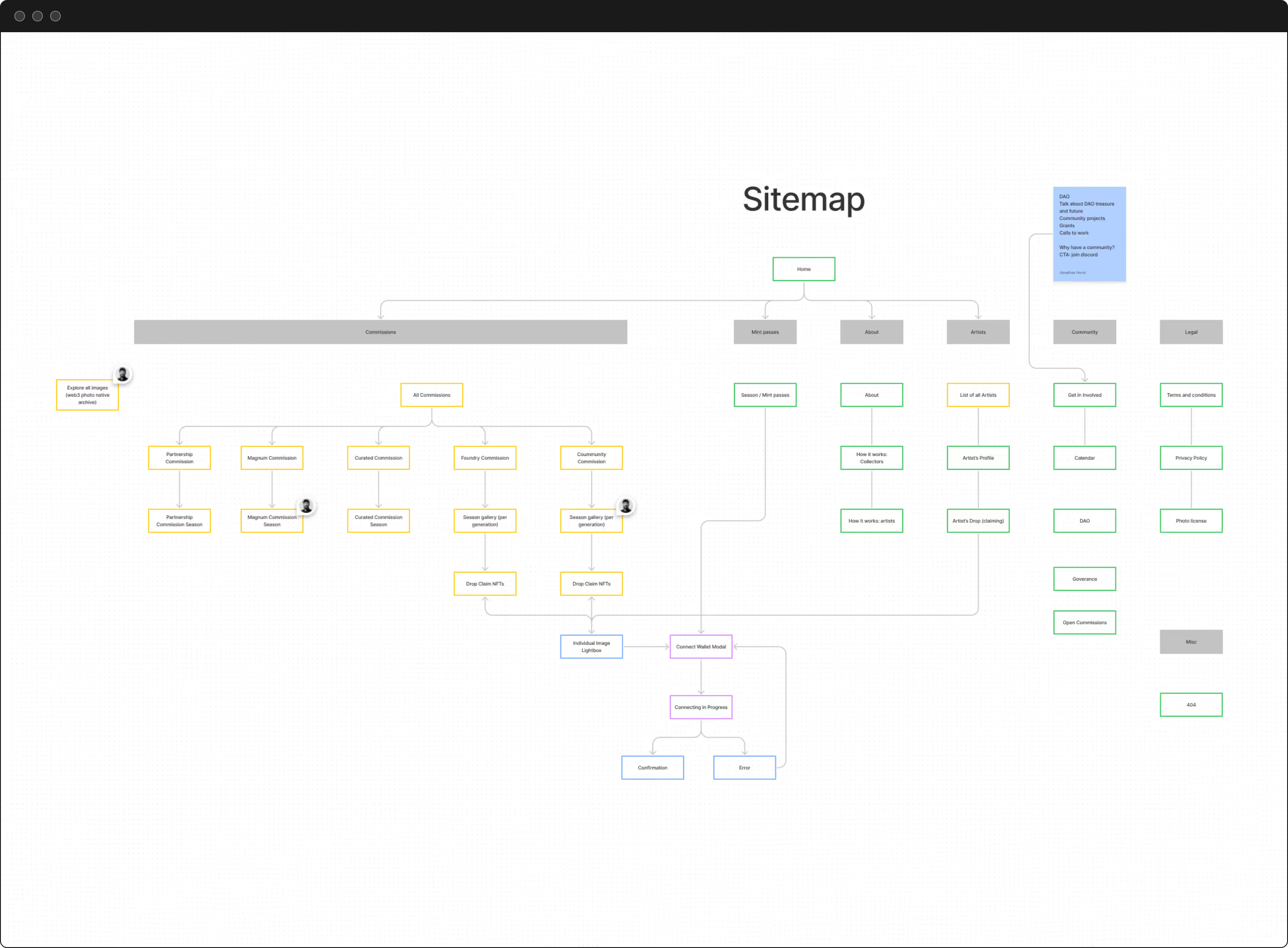
We started by identifying the content strategy and user experience. We used tools and processes to maximize speed and facilitate collaboration.
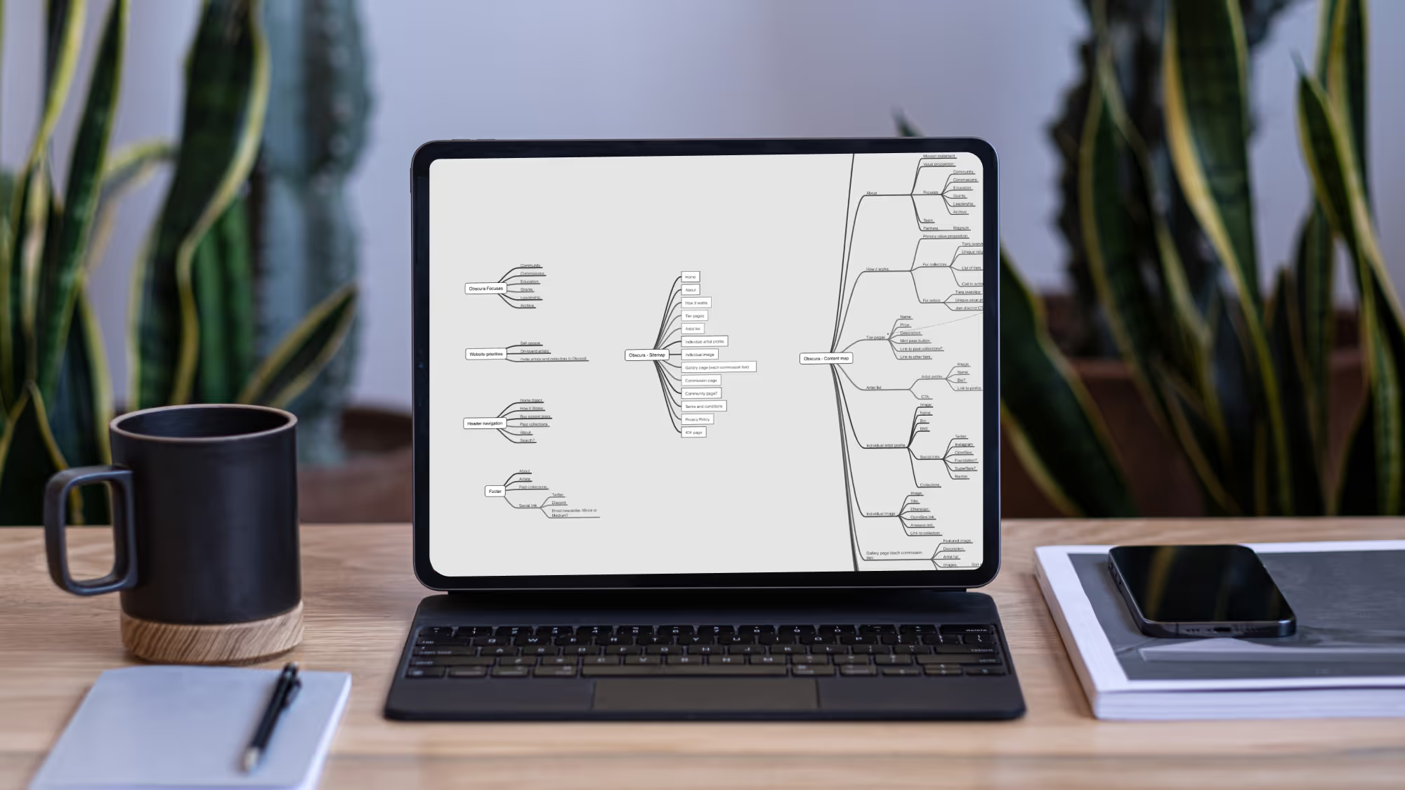
- Sitemaps to determine the page types and structure
- Content maps and low-fidelity wireframes to identify the types and structure of content within pages
I reviewed progress with the founders at set intervals to clarify and refine the documents. We utilized user journeys and sales funnels as the primary framework.
I consulted on serving users and building sales flows. Most importantly, I provided consulting and strategy on how to take prospects from being unfamiliar with Obscura’s brand and offerings and convert them into enthusiastic, paying customers.
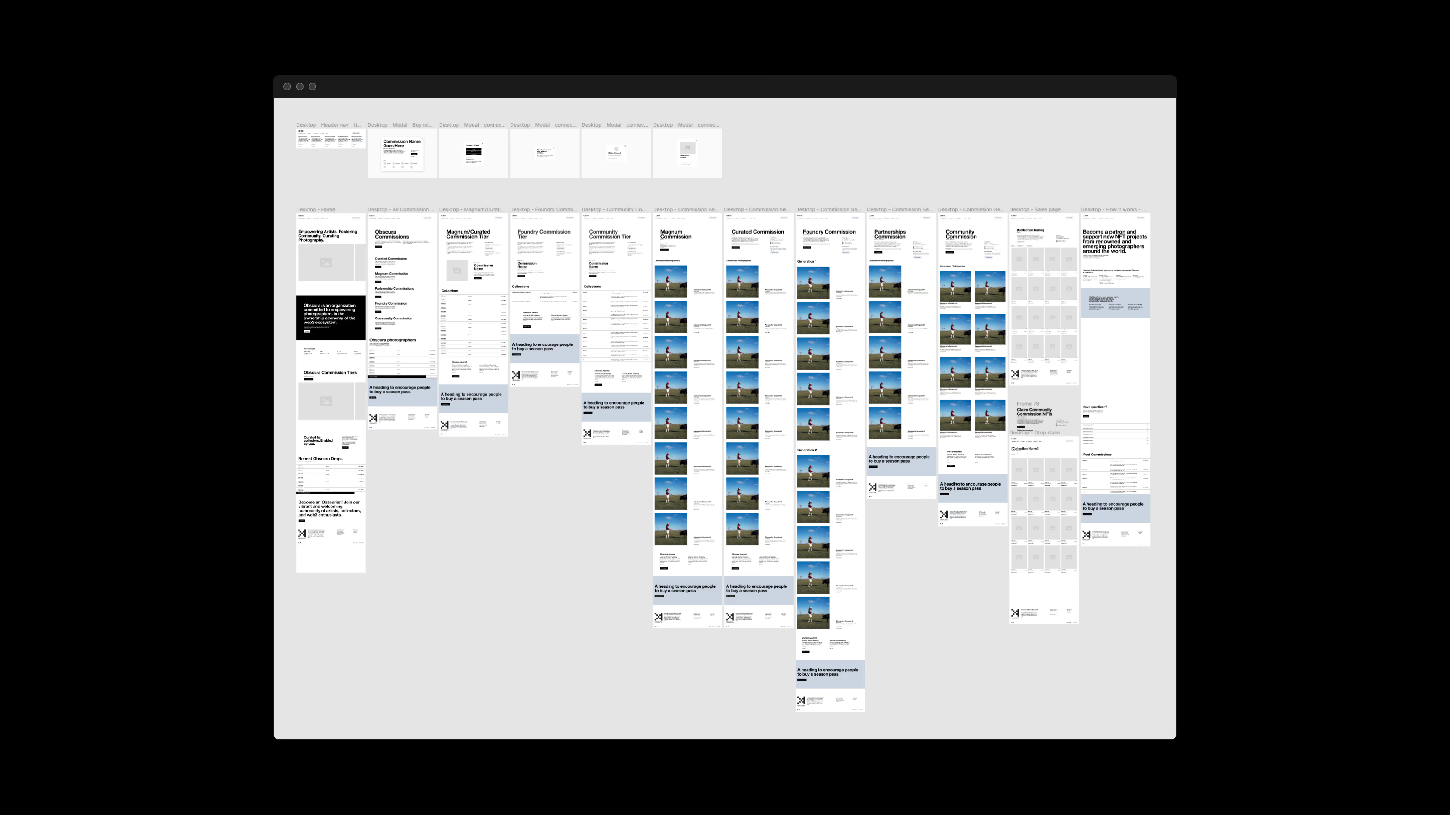
overcoming hurdles
We fully realized how much we needed to rework Obscura’s core product during the content map phase. We found ourselves going in circles regarding the content strategy and wireframes. The complexity of the product caused uncertainty for positioning and content. Also, the scope of the website grew significantly, nearly doubling the scope of work.
Unfortunately, we lost valuable time. We needed to take a strategic pause, reevaluate, and simplify. Streamlining the product and the scope of the website became our priority. We needed to slow down to speed up.
The founders took time to reevaluate and simplify Obscura’s core product. We paused the full website engagement to create and launch an MVP website. Post MVP launch, we aligned on a simplified rollout of the final site with further improvements taking an agile approach.
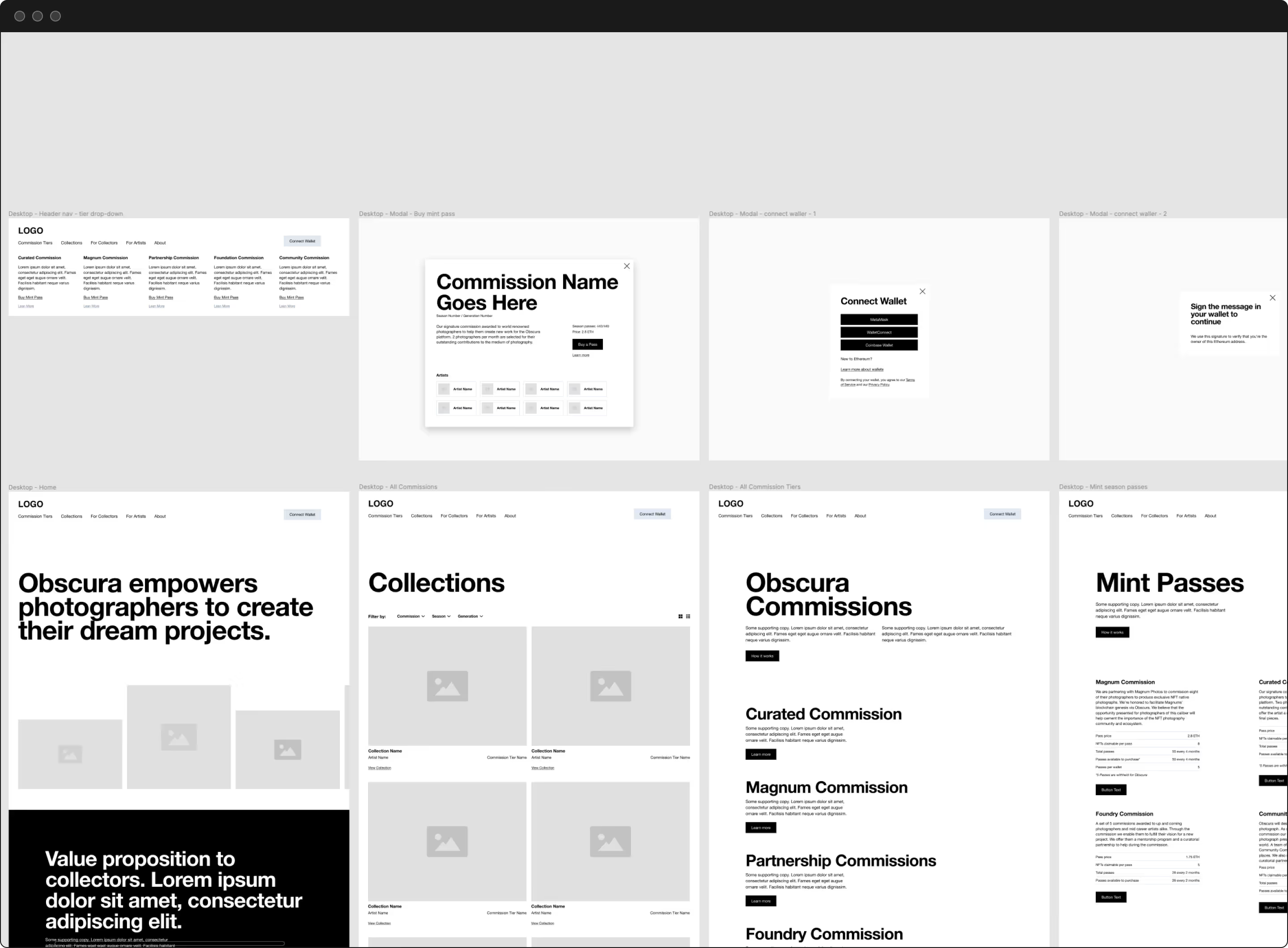

Strategically pausing enabled us to regain momentum and stop wasting resources. With a new plan in place, we quickly identified the sitemap and content map and iterated through a few rounds of revisions on the wireframe.
The MVP website helped immensely in gathering feedback both internally and externally. We gained additional user insight, which we incorporated into the design of the full site.

the prototype
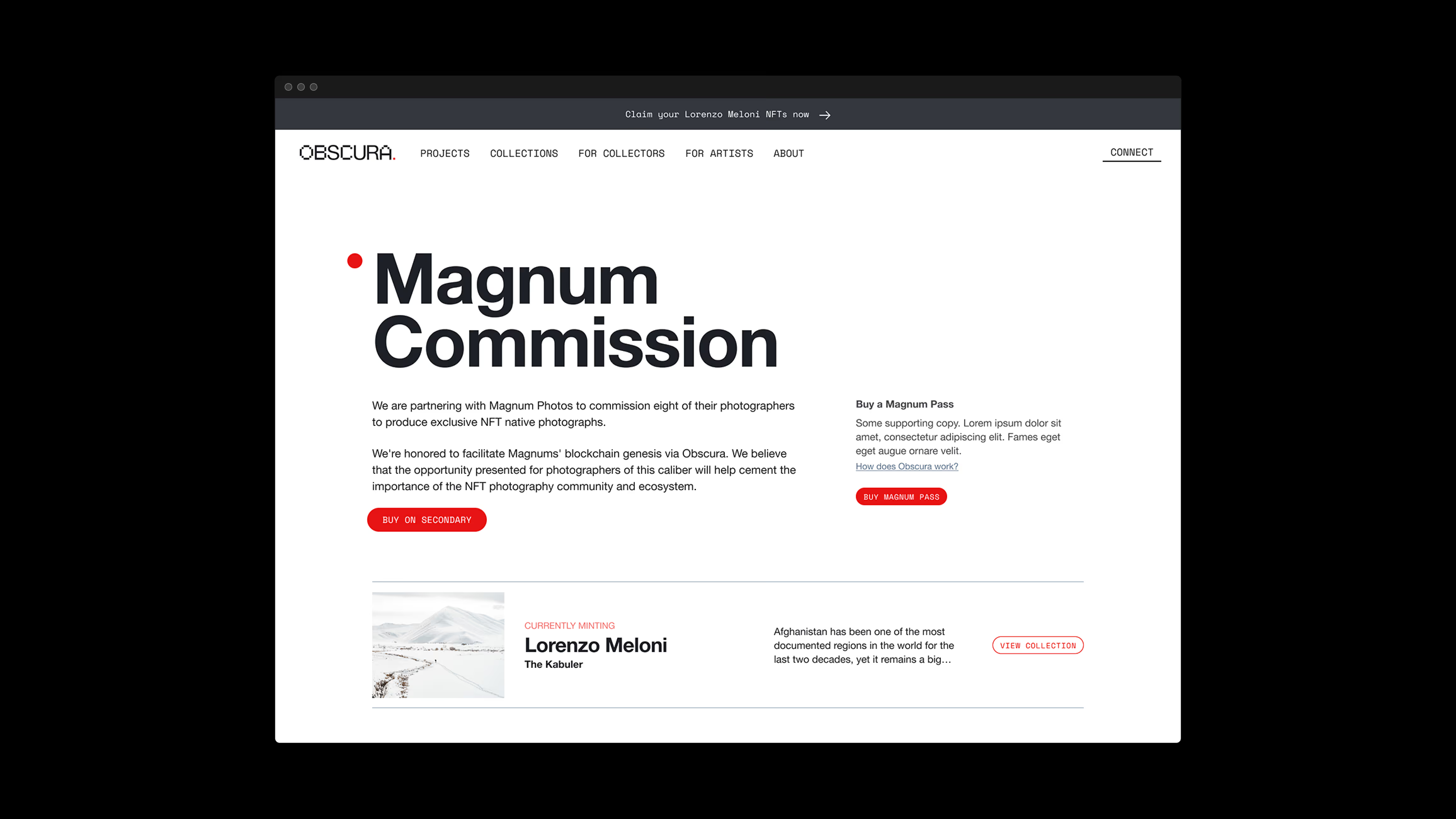
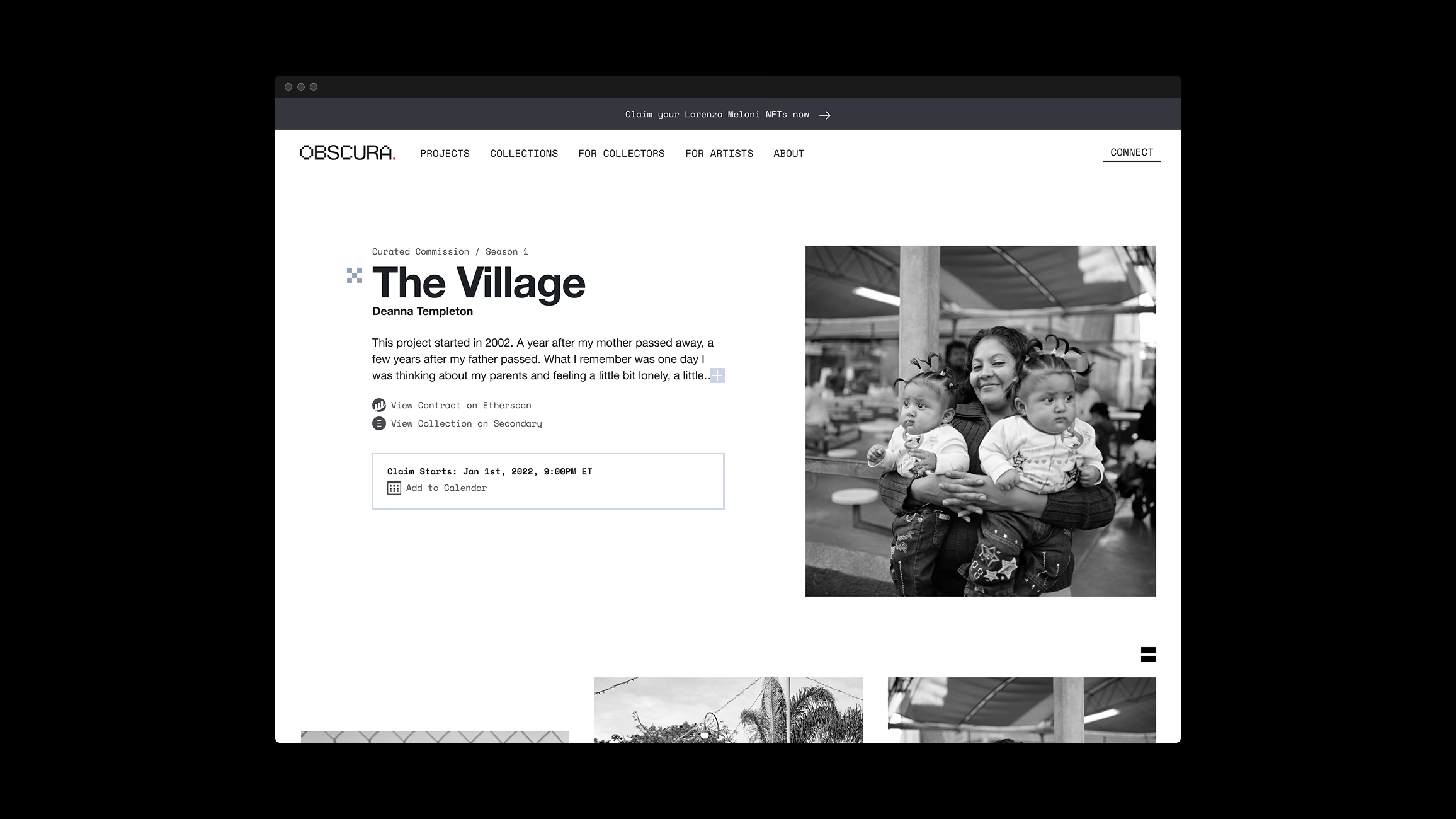
With the wireframes approved, we moved into high-fidelity prototypes. The goal was to achieve as close an approximation to the final site as possible while facilitating quick testing and iteration. All the groundwork we had laid paid off immensely. I created the prototypes with only minor revisions from the team.
This part of the process is the most enjoyable for me. Initially, I prototyped four pages to express how the full rollout could feel. I reviewed them with the founders receiving only minor revisions but primarily significant enthusiasm. The Obscura team loved seeing our hard work paying off, culminating in the central hub of their communication and business needs.
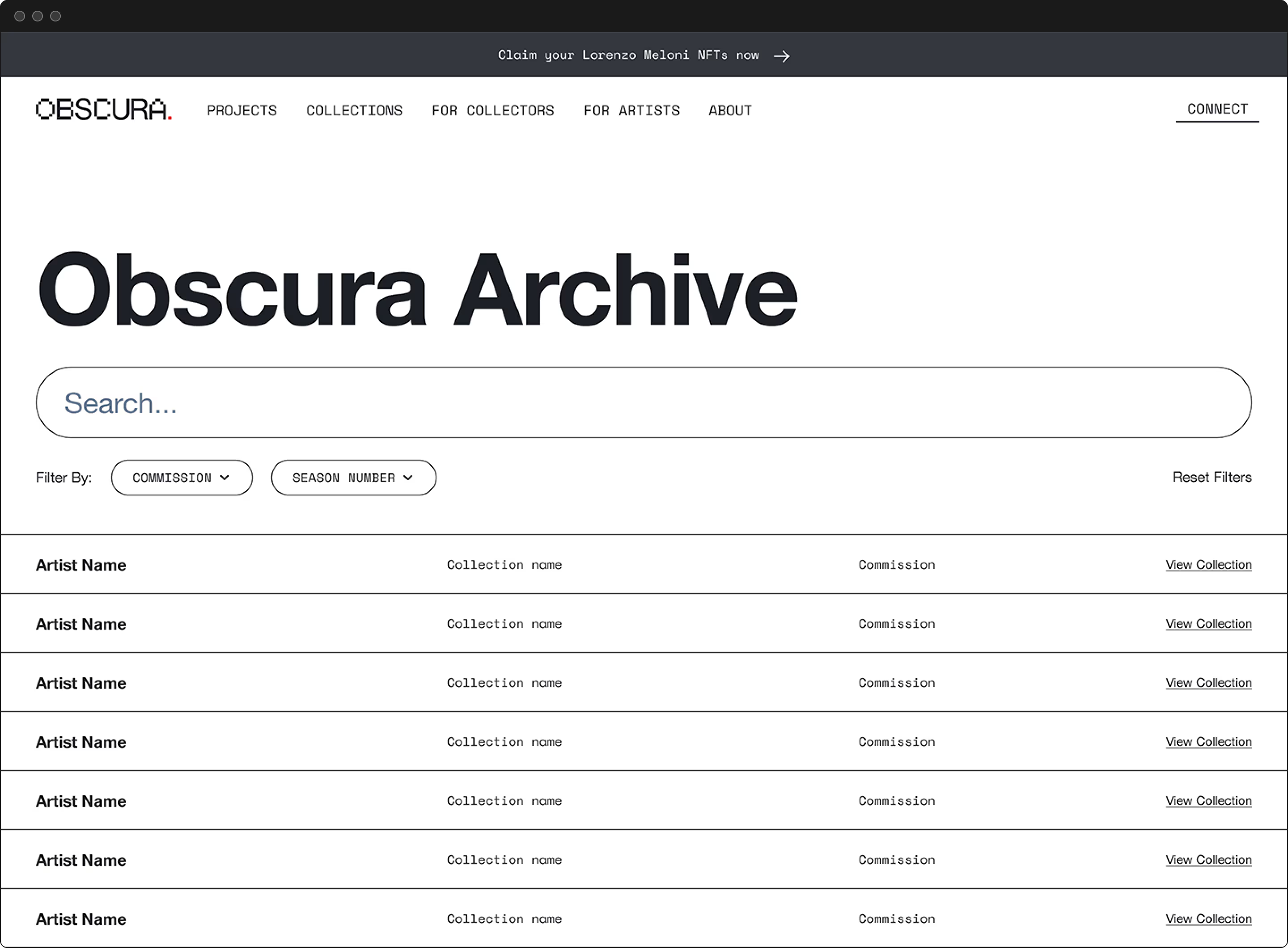
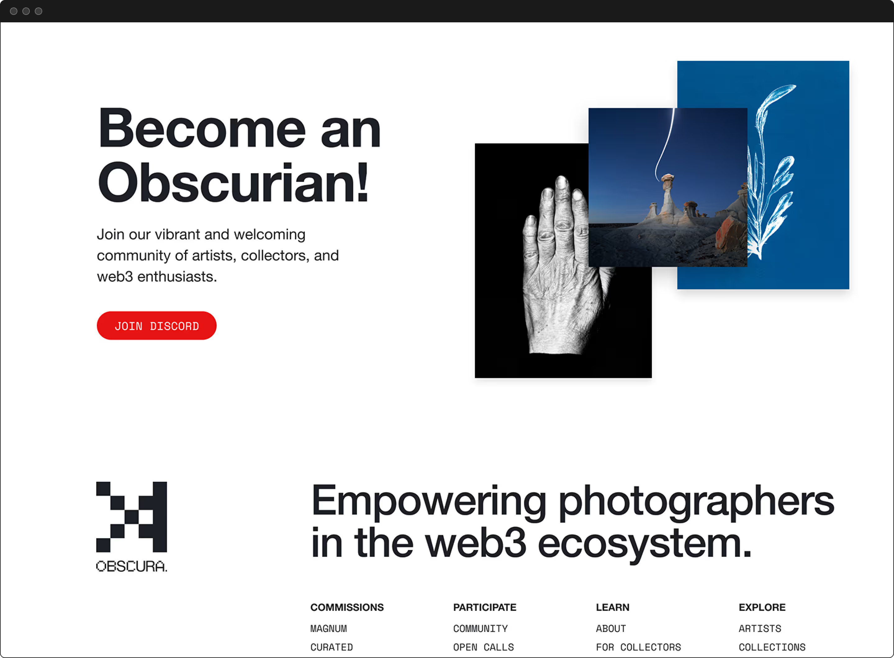
Because we had done the hard work in discovery and planning, we had already identified the website's general structure. I did make several changes based on user feedback on the MVP website. However, most of the work at this point was to use design principles to communicate, guide, and provide joy to visitors as they sought their desired outcomes. Because Obscura works with top-tier photographers, we had so many amazing images to utilize in the design.
The final steps were designing the rest of the prototype, accounting for responsive design needs, testing, and continually reviewing with the developer.
Wrapping Up
Since the start, Obscura’s team, community, and impact grew exponentially. We experienced growing pains and pivots during the growth, but the team worked tirelessly to innovate and push the space forward. They were super happy with all the deliverables and discoveries about the brand we made along the way. In a short time, Obscura has already had outsized success and impact. I’m grateful for having played a part.
