A Modern Digital Experience for a Loved Restaurant
Jazz a Louisiana Kitchen
Services
Digital Strategy
Branding
UX Design
UI Design
Development
Year
2019
<h2 class="heading-xxsmall">Summary</h2>
Jazz, A Louisiana Kitchen, strives to bring genuine, New Orleans flare and affordable Creole cuisine to the areas they serve. Through their multiple locations in the Midwest, they provide a holistic Creole experience from food through entertainment.
Jazz Kitchen leadership wanted to get more guests to their six locations and increase catering customers. To do so, the website redesign was part of a larger effort including social media marketing, digital advertising and influencer marketing. At the core of the strategy was the website. It was crucial to provide an excellent user experience on the website and differentiate Jazz Kitchen in their local markets form competition.
<h2 class="heading-xxsmall">Agency or Record</h2>
TKG Agency
<h2 class="heading-xxsmall">Website</h2>
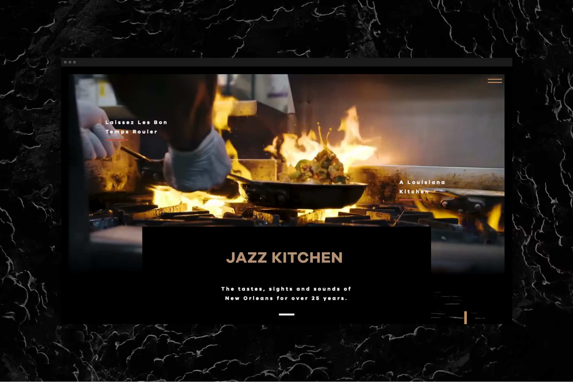
For years, Jazz Kitchen has been focusing on providing amazing food and experiences to their customers. What had been overlooked was their online customer experience and visual identity. Their agency of record hired me to develop a new website and light visual identity that we would apply across all their social media channels.
Research
Based on user research, we learned that the website had very poor user experience ratings. Users struggled to find crucial information like menus, hours, addresses, phone numbers and events. Pulling up menu’s on mobile devices was very difficult because they were PDFs. Feedback included words such as “unreliable”, “slow”, “dated”, and not trustworthy. With this feedback, I set off to provide a solution for Jazz Kitchen provided an excellent user experience, articulated their message and differentiate them from competition.

The catch was a very tight timeline. It was a hard deadline to be ready for their busiest day of the year. I had to develop the visual identify and the entire site from scratch within three weeks.
<h2 class="heading-xxsmall">Visual Language</h2>
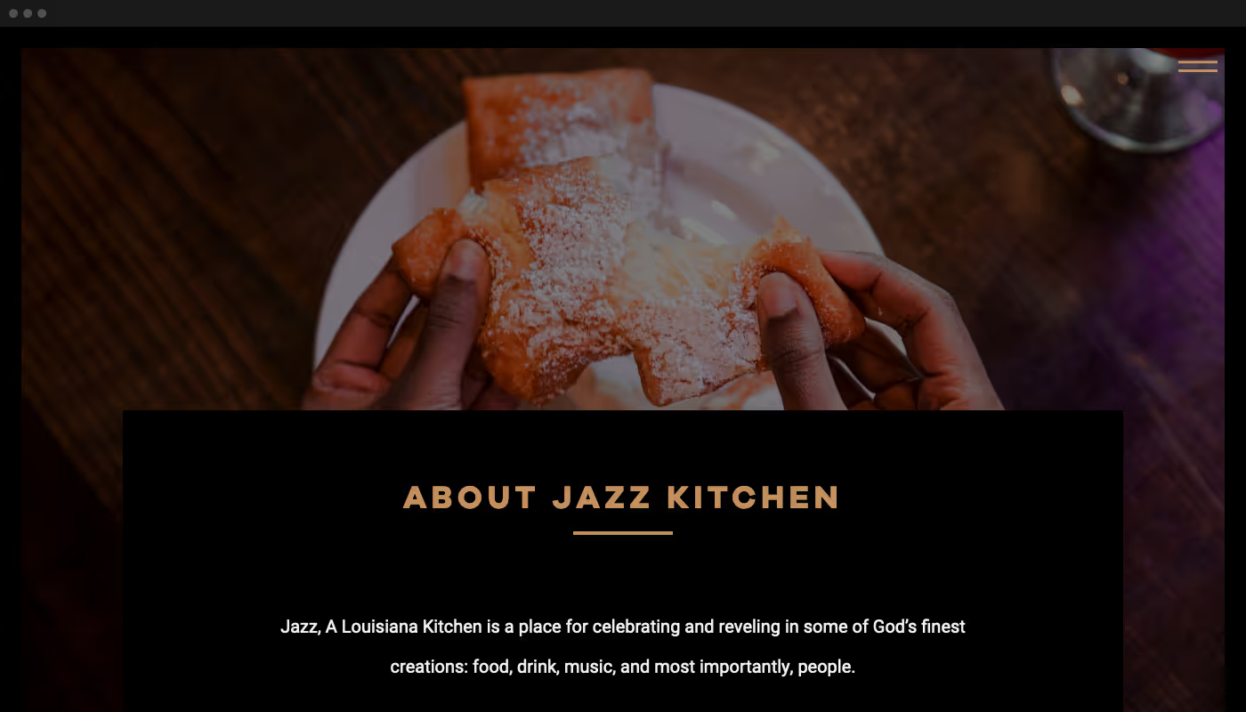
Jazz Kitchen‘s previous website lacked a cohesive visual language. Users communicated it felt very dated and unprofessional. Most importantly, it didn’t articulate what Jazz Kitchen stands for and the experience they work so hard to provide to their customers.
The visual language process started with researching competition and graphic design through out Jazz music history. It was important to represent the legacy of Jazz Kitchen but also the rich history and legacy of Jazz music and culture. We also wanted to cater to a younger demographic. We wanted to represent the rich history from a contemporary perspective while leaving room for improvisation a defining characteristic of Jazz music.
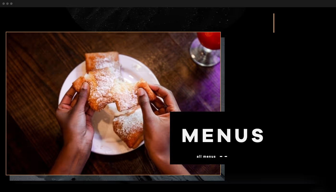
I pulled a lot of references from historical Jazz performance posters: especially the more organic layouts. Another inspiration was the luxurious aesthetics of Art Nevó. Finally, pulling from contemporary Jazz performance poster design I arrived at a clean, modern typography and juxtaposition of organic and geometric forms with slight nods to musical forms.


<h2 class="heading-xxsmall">Prototype</h2>
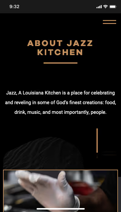
Once I had a vision for the direction, I created a couple different rough prototypes of home page so all parties could get in alignment with our visions. The initial feedback was that the designs felt too contemporary. With that feedback, I provided another directions that focused less on bold geometric elements and colors and rather on warm images and textures. This direction pulled more inspiration from the Jazz Kitchen’s food and keeping it as the focus.
After getting approval on the revised visual language, I moved into the prototyping phase. Here I created a static design that looked and functioned closely to the final website so all parties could be in agreement before continuing. The goal in every project is for there to be no unwanted surprises for the client or anyone involved. This step is one of the most important to consistory achieve this goal. It also is crucial to avoiding redos: one of the greatest areas of frustration for all parties and a significant time waste.


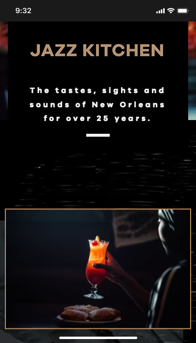

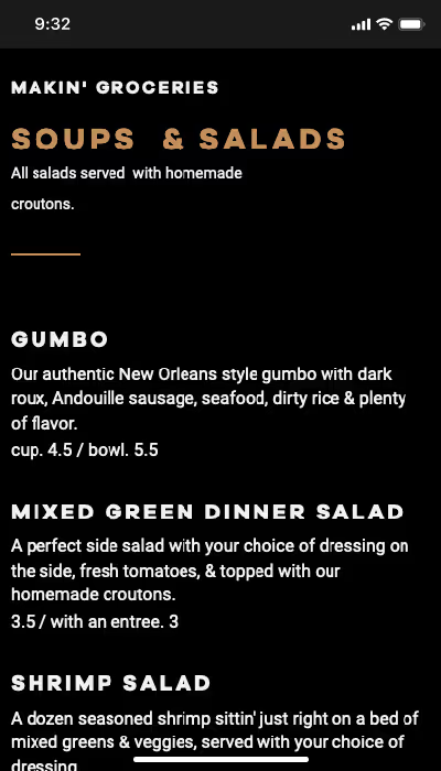
With minor adjustments and final approval on the prototype, I moved into development. It went incredibly smoothly because of all the planning and preliminary steps. As always, there were a few unforeseen slow downs. One of the largest was the menus.

Menus
One of my key goals for this project was to present the extensive Jazz Kitchen menu in a very easy to use presentation. Many potential guest are making decisions which restaurant to visit while researching on their phone. Menus are a significant deciding factor. With this in mind, I wanted to ensure that the menus were optimized for mobile. With all the marketing and advertising effort, it was crucial that the final steps of the user decision-making process were seamless. It was also essential to make the menus easy for staff to update.


What made this part particularly difficult was the length of the menu and the numerous repeated items across the menus. Form an administration perspective, it is very difficult to keep repeated information accurate if you can’t edit it at one location. The solution I developed was a custom content management system for the menu items. This enabled the staff to edit all the menu items in once place. All instances of a menu item only had to be edited once. To make editing menu items easier and more consistent, I created templates with default options.
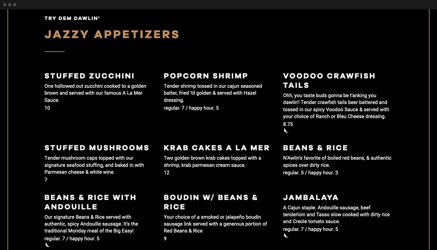
This is where four years of web design and development experience and a tool like Webflow saves the day. Projects like this often take over a month. We were able to wrap up the project two days before the hard deadline finishing the website in under three weeks.

Resolution
Customer feedback has been great. I reduced page load times by two to three times. There are no longer any unexpected website behaviors. User feedback has been great.

