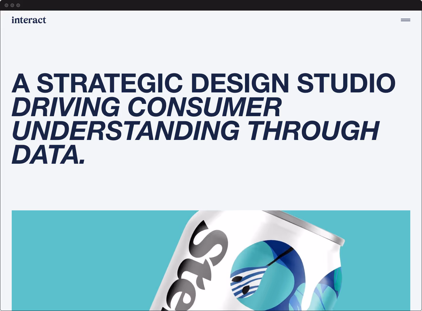
Designing a minimalist e-commerce experience

Faire

Services

Strategy
Branding
Art Direction
CX Design
UX Design
UI Design

Year

2016

<h2 class="heading-xxsmall">Summary</h2>

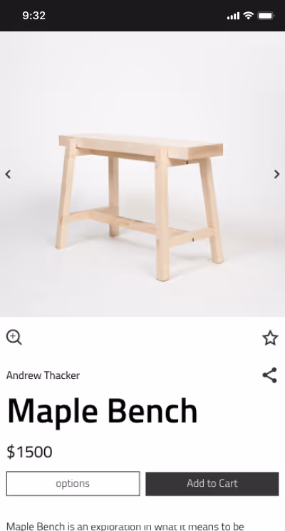
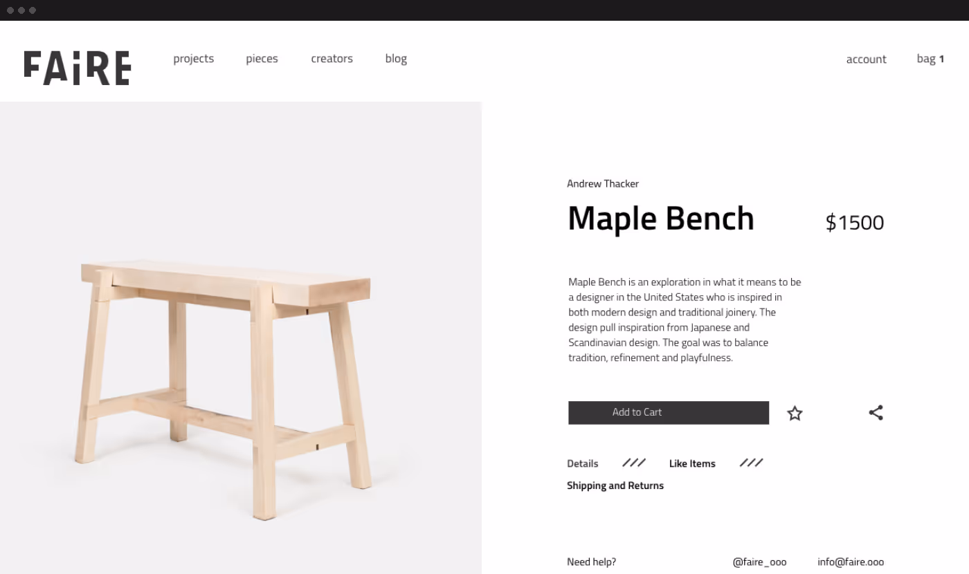
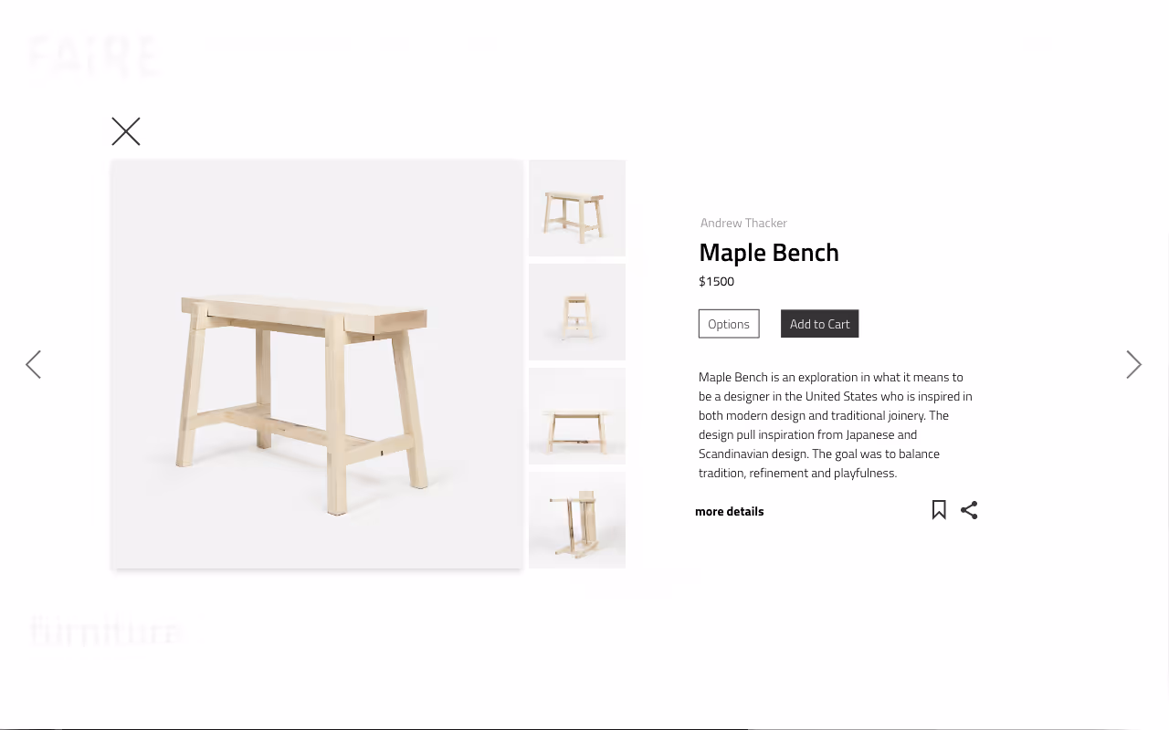
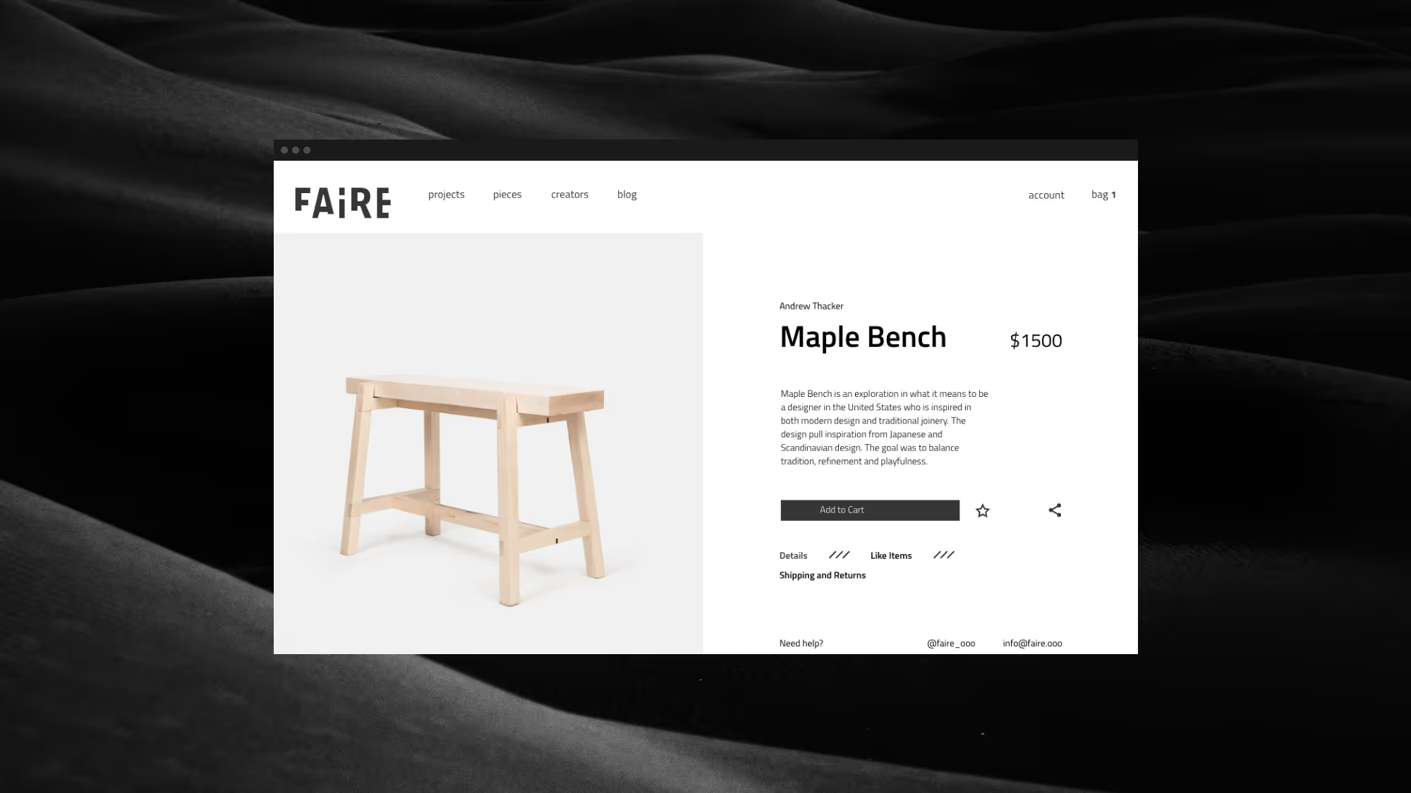
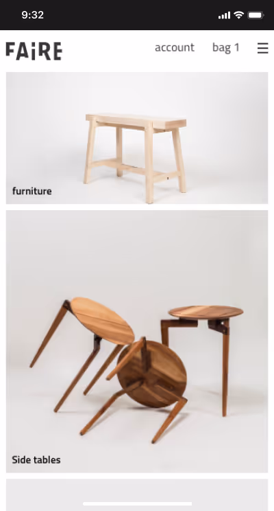
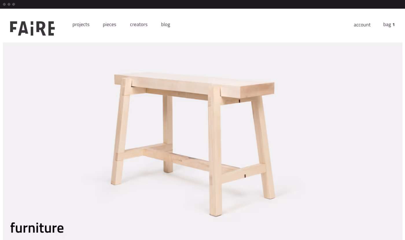
Faire is a curated marketplace featuring artists and designers in the Midwest.

It is the physical embodiment of its founders’ collaborative spirit. Taking cues from modernism, nature, and contemporary art, the curated collection seeks to introduce the World to the work of the artists that live here.

The home page was intentionally very simple. The layout was made up of a serious of simple rectangles of images with minimal text. Customers could easily skim to find what was relevant to them. The main navigation balanced both the focus on selling products while telling the story of the designers and brand.

The Goal

<p class="text-size-medium">Our objective was to create a website that communicated Faire’s ethos and e-commerce experience that balanced conversion optimization and storytelling. The website needed to communicate Faire’s value proposition and tell the story of the individuals it represented.</p>

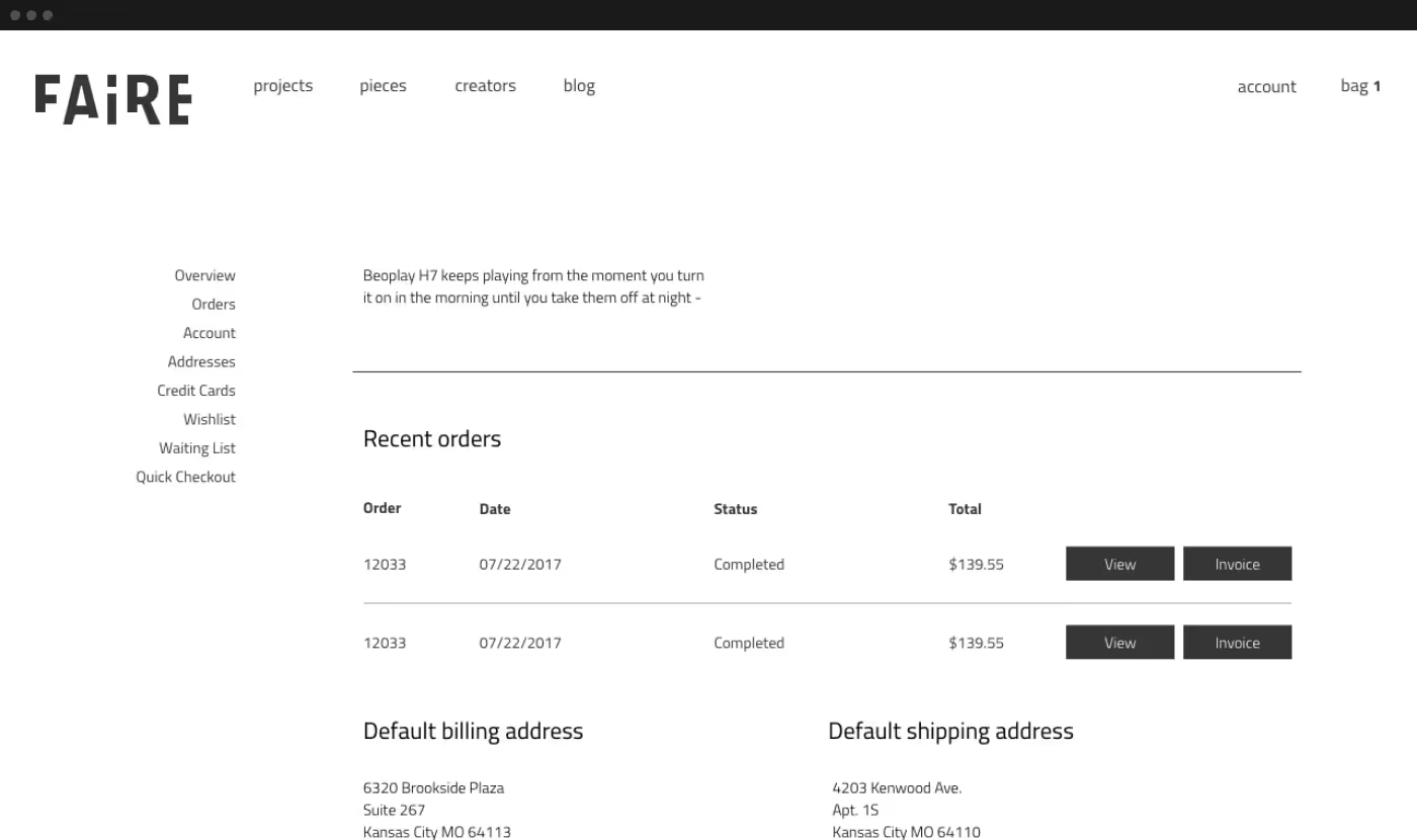
<p class="text-size-medium">The website would be the central hub for the brand. It would be online almost exclusively with occasional retail and experiential pop-ups.</p>

<p class="text-size-medium">The brand identity was minimal with a subdued color palette. For the website design, we wanted to keep the images front and center. The elements should be utilitarian and simple. </p>

For the product page, the design included several levels of information so the customer wouldn't be overwhelmed but could learn more if they were interested. To provide customers with more confidence customer service information was included. Many of the price points were high so customers needed to feel comfortable and confident in their buying decision.
For products listed on the home page, category pages and in featured sections, I added a quick view pop-up. A customer could quickly see the high-level information about a product without leaving the page they were one. This way, they could quickly compare on contract while still in the research phase.
To shorten the buying journey for users, I opted to not have a bag or cart page. Instead, I included a mini bag that customers could utilize to see the status of their bag and update as necessary.

Start a Conversation

Want to discuss a project or be friends? Let’s chat!

Copy email